Most viewed logos – Page 488

This is the concept the client went with because they thought that its simplicity and elegance would reproduce better on apparel.


logo should be vertical, label for genepi liquer bottle.

Logo created for my freelance graphic design business.

Glacier Ridge Media created a logo that represents Real Estate and Lending. Neighbourhood Lending is a Mortgage Specialist and offers solutions for all of your financing requirements.

Company sphere of activity is medical equipment and services.

daily feed personal blog

Talented buisnessman, Philippe Brami is also a renowned caterer on Paris for years, organizing receptions for high quality departments or major corporations. Brand Brothers gave the structure a premium brand identity and a chic and retro branding , with a logo inspired by flavors and emblematic ingredients.

Logotype for the hosting company


This is our own logo designed for initially for this company. Idea behind creating this logotype was just to make it visible ad readable in its simplicity. Since the name CRAZYDES evolved from CRAZY and DESIGNERS , we were keen in making it simple and easy for everyone to read upon. With this thought in our mind, we had created this logotype with the crazy Y letter in between the two words.

taman ga center – soon to open center in austria
Logo for Digital Media Agency, actively looking for criticism, WIP

Brand name and logo design for coffee and other bean related business.
Redesign personal logo

Conipas

Housemusic.tv - Music Site http://ekran.in.ua/

Personal Logo for Comedian Bob Smiley.

Designed for The Creative Kingdom, Design Agency in Brazil in 2012
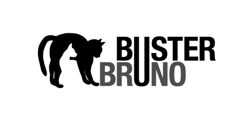
This is a personal project to create a positive/negative identity for a typographic illustrative children’s book called Buster Bruno.
Simple use of the distinctive profiles of Buster and Bruno my two cats uses the negative/positive space to created logo mark. The linking of the u from both words unites the two cats as they are brothers.
Arab El-Tahreer means in Arabic (Arabs of liberation )......... it is an association that had taken place after revolution and is mainly working on spreading political awareness with also some other charity work. (The logo Icon is designed from the association name in Arabian calligraphy )

The logo was created for IT specialist, which quarantee quality like swiss things.
Logo for a fitness establishment where fitness and spirituality go hand in hand

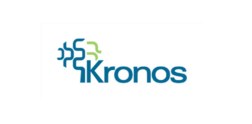
Logo for Kronos company made by Logodesigner studio. In use by client.