Most viewed logos – Page 480

A possible morgue name.


Inspired by the morning star of Jesus. MMLJ comes from Matthew, Mark, Luke, John, which describes the life of Jesus in the world. This logo will be used for the brand of Christian t-shirts.
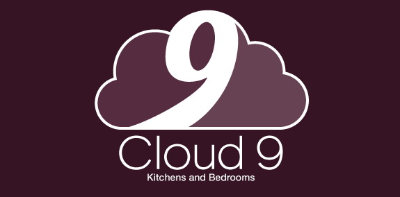
The number 9 blended into a cloud shape with subtle shading


It's a logo made for a graphic design studio. The word "Creabug" is a combination of two words; creative and ladybug.
. the company is located in hyderabad. it is a multi cab service company . mainly focused on M&C, car. as per client inputs . the logo represent the trade of the company, in combination of M&C it looks like a car

Beauty products seller.

Logo designed for a luthier - www.camarotabass.com

logo for a real estate company based in mexico.

Art nouveau funk

New brand added to my site. First attempt at this style of logo design. Comments appreciated! Cheers

I am re branding my self as a freelancer so this is the first in a long line of changes to my online identity. This logo for me speaks of simplicity and slight elegance, which kind of fits my creative personality.
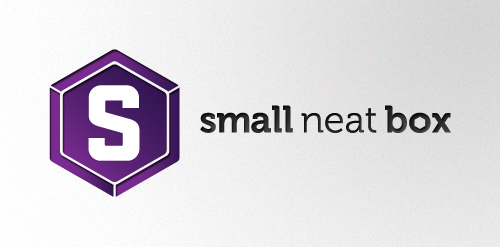
Small Neat Box is a secret project we here at Simple as Milk have been designing for, our client Rik Heywood is producing something very special for designers and developers alike. We just can't tell you what!

logo for a client - a chain of refreshements supply company : "Chai" in hindi stands for tea...

funk band in switzerland

logo for photo company

Drawed for website which dealing with soccer news in Holland. Unfortunately didn’t realized.

internet solutions / 2010

With Adam Films we wanted to categorically move away from the clichés that the name Adam carries with it and we finally froze on ivy leaves which can be seen in historical depictions of Adam & Eve. These ivy leaves, concealing and revealing were in context to techniques used in traditional film making. Adam Films is a collaborative work with Sushil Chintak.
This logotype has been created for Pranzo in Ufficio who delivers lunch and food to many companies. The idea behind the logotype is to mix a fork, wich represents the food, and a tie, wich represents business companies :)


battalion 44- Team badge for Battlefield
follow me on facebook
http://www.facebook.com/yaceky
A simple logo design ideal for companies that promotes eco-friendly products and services.

Alexandria Philatelic Society is a community for stamps collectors in Alexandria.. the logo reflect the shape of stamp and a symbol of Alexandria "Qai-Tbai castle" with letters "aps"..