Most viewed logos – Page 476
Logo for a new startup printing agency.


Victory Garden Zoo— An expansive wildlife sanctuary.


Logo design for a travel company for groups
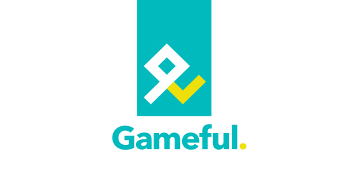
Gameful is a bit about people, a bit about game mechanics and a bit about branding, service design and overall UX. It's focusing on a person as the main receiver of the gamification approach. And so the logo shows.

Logo redesign concept for existing company.

the name reflects sweet and good results in where you find cooperation among respectful stuff

This logo is inspired by Chinese culture. Perfect for restaurants serving chinese dinners.
Blackbird is a new company, which has as main objective to offer support to investors, showing real estate business opportunities for major players in the market.

A logo to represent the Out of the Garden Project, which is an organization focused on providing food to less fortunate children over the weekend in order to remain on the same cognitive level as their peers.
Real estate blog in Los Angeles

technawi is a wepsite for the students of Jordan University Of Science & technology.
(Ivan Anderson) is the name of the owner and also the name of his business agency .

The links and nodes in the vignette are the dynamic connections in the company. Due to the various departments of the company, the company is standing at the intersection of several disciplines. These nodes represent a flow chart with the corresponding (stylized) symbols.

The logo communicate instant “medical” and “toothbrush”. If you add these to words its easy to think of a dentist - and thats what the logo is for. The tone of voice is clean, and the color is the code for “medical”. The toothbrush symbolize the Rod of Asclepius (Asclepius was the Greek god of medicine). He was holding a rod with a snake rapped around it. The snake symbolizes the snake bite, which was the worst kind of disease someone could have in the antiquity and very difficult to cure. However, Asclepius had the power to heal even the snake bite. This rod with the snake is known as the Rod of Asclepius and is even today the symbol of the physicians throughout the world.
The picture mark: it contains the initials of the brand name "Agentur wildwest" (AWW). In their star-shaped positioning the initials result in a sheriff's star which illustrates the name of the brand clearly. The brand name: it was thought out for an agency which is located in the West of Germany (Cologne). Besides the agency is well known for fearless and anarchistic design conceptions.
A sail boat on the top of a sea wave with a sky and fish that are shaking with it .
Logo for NUMBER GROUP - financial services.

French BIO company

Print Logo

Sailors' is beach cafe,, about the logo, dont try it at home if you dont want loose your glass :D

Stampede theory.

Logo for a Nigerian event photographer.

School project "Teatr Lalek" means puppet theater

A logo with a bull in it. A red bull. This was just an exercise. I wanted to achieve that angular feel a lot of designers do so well. I wonder if I managed even a little bit.