Most viewed logos – Page 467

"Lourencos’s is a company that works with lectures about sales, marketing and personal behavior. We decided to represent the brand in a symbol that reminds at the same time to an "L"of Lourenco’s, the world and an arrow indicating growth. We created a printed material that transforms into a mug, to create interaction and curiosity during the lectures.”


Architektur und Inneneinrichtung


Gallegos Frixione Arquitectos is an architecture studio based in Managua, Nicaragua, founded by Herman Gallegos in 2005. The goal was to achieve a modern visual style that projects professionalism.


Logo design for cocktail bar based in Jewish quarter, the lines suggest the Jewish calligraphy, lion - symbol of Israel and strong symbol of power in jewish culture. Nose of lion is also cocktail glass. Lines on the sides = lions mane / water > purity symbol.
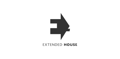
Extended House. Negative space used for the letter E. The house serves as a perspective to this letter E.
Noya logo
Lobster Doodle is a software developer based in Edinburgh, Scotland.
The logo shape is a lobster claw silhouette cutout, with the background color defining the claw color.
I tried to keep it simple, but recognizable.

An IT solutions company logo.

Logo for a creative agency

Designed by www.logodesigncreation.com


This client was looking for a vintage surfer feel included into his video production company logo.

#SSG


Another Proposal #SG!
Logo designed for an artificial grass company

The company does space design, themed packaging and corporate gifts.

Online shop with retro fashion
custom type
http://www.facebook.com/yaceky
Art(fresco) & programing(code).
Objective- Simple, professional, meaningful & clean.
Symbol- art brush enclosed in html tags, art & programing working together.
Typography- curved & sharp edges used alternatively(artistic look), each alphabet approximately a square(digital look)

logo for a small architectural firm based in mexico.
A unique brand for fashion and apparel business.

The direct marketing logo represents a marketing agency. The arrows in the logo represent the communication back and forth. This logo could also be working for any other kind of company. You can buy it here: Direct Marketing

Logo of an hi-fi ecommerce website for an application demo