Most viewed logos – Page 441


Negative space parrot.


"The brand of this architecture office was designed based on a totally new study on the concept of the word IDEA. The symbol developed represents a thought or speach bubble, which is the visual representation of when you feel an insight, or in other words, an idea. The colors used in the brand are yellow which expresses attention and navy blue, which works with the seriousness and the commitment of the studio. The brand itself is applied in 8 different mutant shapes, giving the conception of the different sectors of architecture.”

EFC is a football combine testing event for high school age players to test their physical skills. Athletes are tested in speed, agility, strength, and skill.

unused proposal for finance company.name of company was taken from old popular lithuanian song. kite and letter J together. In lithuanian mythology kite brings money.
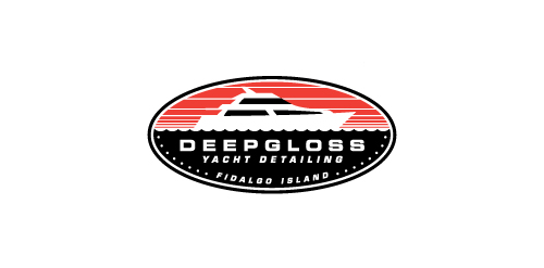
A yacht detailing business.

Mugla is a County of Turkey and this is Mugla's logo... 2013

Advertising management system
DuyTan University Logo
Logo para concurso de identidade visual para uma rádio. Logo for a visual identity contest for a radio.

Voip.
I was asked to make a logo for a band in Greece who’s music style is not yet determined and want to keep it that way. Therefore, I decided to keep it minimalistic, but to strengthen it by playing with opposites. What I did was create a tension within its style as it is both iconic but also has a child-like element. These elements keep it both playful and serious, creating an open image for interpretation, just like the bands name.

Cardiovascular Therapy company that works on the engineering of new meds with pharma's

Product Logo
Logo design for potential Didgeridoo business in South Africa. Black and orange to Represent the content Fusing cultures


Large ministry working mainly in Haiti, running relief projects, schools, orphanages and building complexes.
Normlas is a technical agency in shipping. One of the wishes of the client was a friendly logo and a ship as a symbol.

DNA Job - talent management and e-learning

* Logo for a company that distribute safety equipment for workers. * A for the shield.

Logo for movie blogger.

Logo for vintage shop