Most viewed logos – Page 434
Netsprint


Logo design for website offering e-books, audiobooks and movie adaptations of school books. Basically the idea was to combine classic books into something more digital. Then came the idea of combining open book and screen.

A logo for a belgian patissier-chocolatier based on the initials of the chef.

Personal Portfolio Logo Concept.

M.
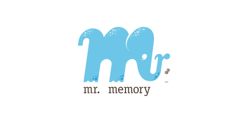
This completely fictitious company logo is the result of happenstance typographic exploration.
Through modification, I discovered that a lowercase M, set in Matrix Script Bold, began to resemble an elephant. Realizing the potential for a self-initiated logo development exercise, I dubbed my hypothetical company "Mr. Memory," an allusion to the idiom, "an elephant never forgets." With the addition of the R and the peanut as a punctuation replacement, the character exists both as an elephant as well as Mr. Memory, himself. This company could be one that manufactures RAM or external hard drives, or it could be a learning center.
Click here to see the case study for this logo, which chronicles its development, and includes full design rationale, sketches, electronic roughs, and alternate designs.

Stickman style sign representing programming the human.

Mistakemistake Tribute

Personal ID-Logo, located for a freelancer in Germany.


A very simple hairdresser logo.

My personal logo.

Startup company that produces filtration systems for heavy equipment operators

Diamond Pen logo

Obj 777

Logo design for Irish Campsite / Pet Farm

Logo design for Venunye Premium Coffee