Most viewed logos – Page 431

MUTICUS is fresh modern dynamic brand with short easy memorable name. It will suite well to any business or industry.


Geek Eyewear ®, who sell chic eyewear celebrates diversity, individuality, and creative enthusiasm of Geek culture.
A flippable, reversible logo that always reads the word ‘GEEK’ no matter which way you look at it. The shape also looks like a geek wearing glasses. The angular shapes relate with the technology industry, whilst also looking like an alien language.
Unfortunately this logo design was not used by the company.

moonwalk midnight


Logo made for a academy

Happy Hounds
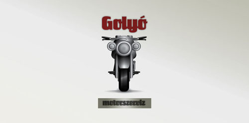
This logo is an motorcycle service made.

A crown house.
The GPMP is an architecture and surveying company. The logo reflects the work area, dividing the typography in the middle, representing: heaven and earth. At the bottom is there reference to the topographic lines.

this logo was made for a project, selling the intangible. i decided to sell subconcious,and came up with this design, with half a lotus flower (pure) and then half the brian (mind)

This was a logo design for a National Park in Canada.
logo design for an event: Food Fesival since 2010. Client: Eurocharm

Done for fun


Full range of IT support services
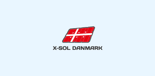
another concept for a dutch company which installs solar panels.

Design Studio

Resort Logo
Logo para o Aniversário da Cidade de São Paulo - 450 anos. for the Anniversary of the City of São Paulo - 450 years.


In order to make the characteristic mood of the coffee bar stand out, I decided to realise a simple and playful logo, suitable for a large target, which nevertheless doesn’t look childish. By entering the pub, customers will be able to sip a tasty cup of coffee, and they will be asked to answer to the enigma that our riddler will leave inside the biscuit given with the beverage. No signature, no pictures, riddles will be associated only to this logo, which will be signature and symbol of the mysterious riddler. This way, the logo will have its own identity, hiding an invisible-but-always-there figure.