Most viewed logos – Page 425

Logo for company for reforestation.


wytłumacz.com - high quality speed translations

...

Logo for company dedicated to trophies


TV commercial post-production agency.

Logo for a business coaching and personnel development company in Austria.

Logo para fábrica de gelo. Logo to ice factory.

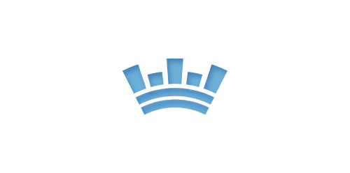
This is the symbol for Crown Tenant Advisors, a Medical Realty Consutation Firm. The intent was to give a new company a simple, recognizable identity by incorporating a skyline into a crown.

Logo for Spice and Grain Company
This logo for my Business. illustrator

Logo for translations & teaching agency, specialized in Dutch language. The initial N icon represents the transition & transformation of one language to another.

ITSM Lab | IT consulting

Geek Eyewear ®, who sell chic eyewear celebrates diversity, individuality, and creative enthusiasm of Geek culture.
A flippable, reversible logo that always reads the word ‘GEEK’ no matter which way you look at it. The shape also looks like a geek wearing glasses. The angular shapes relate with the technology industry, whilst also looking like an alien language.
Unfortunately this logo design was not used by the company.

Ladies Beauty Parlor

A logo for a PT in Sweden. Stark och Sund translates Strong and Sound. What better to describe these than a strong heart.

Online Clothing Stores

Hen and hand together forming the shape.

Client work. The original name is "Now make me a sandwich", but i just renamed it. They have a Food truck, makes all kinds of sandwiches. The client wanted illustration of viking.