Most viewed logos – Page 286


Logo for "Nad Marychą, Czarną Hańczą i Niemnem" Fundation (three rivers in the title).

logo created for a restaurant based in mexico.


Logo for a holding and investment company.

LeBaby logo for Australian e-shop, where you will find all kids stuff. Finished - approved logo.


Logotype for shoes company
Unused concept
Sirotek & Gemerle is an advertising agency based in Prague. The logo combines initials of the founding members with an ampersand.
Brand designed for lawyer with modern concepts.

This logo was made for a blog that is about giving tips on how to fall asleep and how to wake up early.

Creativity agency.

Logo for a jewelry company.
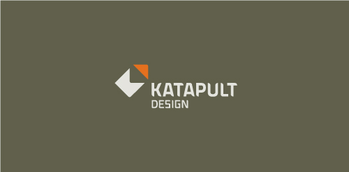
Katapult Design is a firm out of Australia who offers industrial and graphic design services. Concept: Client requested a very, very simple solution. The red corner piece appears as if it's being hurled away and the resulting two pieces are abstract K and D letterforms.


Online Printing Services

A logo for real estate company.
FairApp Logo Design


Taaleem, which means 'education' in Arabic, is committed to inspiring students and helping them to identify and develop their passions and talents. We only recruit the best international teachers who are capable of delivering our international curricula in a creative and engaging manner. Taaleem seeks to raise the educational standards in the region. The combined experience of its core team of senior education leaders in international education policy, operations and global management best practices means Taaleem is well positioned to ensure the creative of truly exceptional schools that satisfy the most comprehensive and exacting education developmental requirements.

It could be use for businesses like - Cafe, coffee bar, bar, cafeteria. Secret meaning: Bee + Honey : Color and shape used to make cup of coffee. http://www.brandcrowd.com/logo-design/details/130325