Most viewed logos – Page 265

Landscape design


for wood carved mobile covers.


http://www.facebook.com/yaceky

The keywords in the brief were - security, prosperity and stability, so I thought of the image of a great tree. Any critique will be appreciated.
Logo for a local Kansas City artist and photographer.


Lettering logotype for "hello, we are." a studio based in Austria which specializes in animation and visuals.

Copyright © 2014 Marius Fechete

Logo for gasoline distribution company.
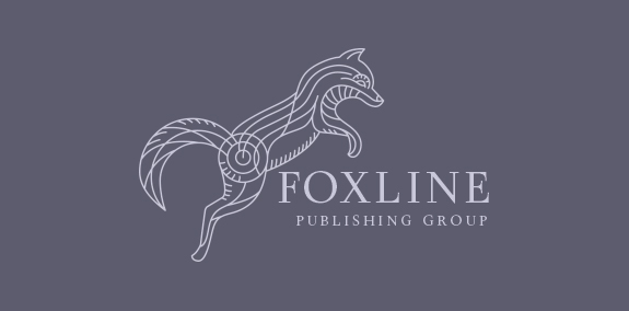
Jumping fox logo created with sleek lines that create a unique pattern within the fox. The lines are used define the fox’s face, tail and body, which create this unique and distinctive fox design. https://www.logomood.com/downloads/fox-line/

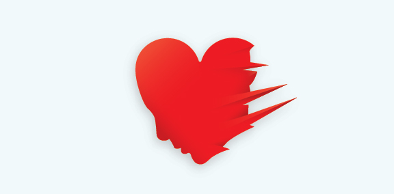
Heart + Face + Ice Logo Design

Ambigram made for MARGAUX
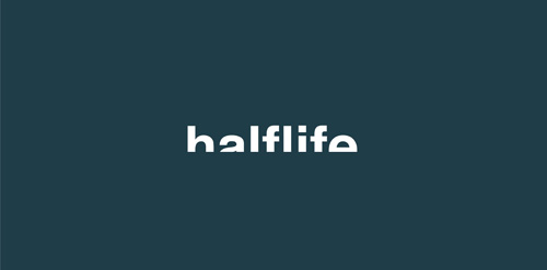
Branding for a local band called Half Life. I used a concept for the logo that was fitting to the band name and would work across the board on album covers, promotional material etc.

Grill × Bar × Boutique
Logo para programa de TV esportivo, onde a pauta seria sempre uma conversa descontraída sobre as partidas de futebol regionais.

it is an anti logo for an up and coming t-shirt design company

R Monogram

Logo for transport department of Lviv city
Buffalo Dining Club is a new concept bar from the team that brought us Table for 20 and Sticky. It centres on good produce, good service and good times. The identity created takes cues from mid 20th century diner-style brands and typography as well as drawing inspiration from classic Americana.