Most viewed logos – Page 224


UFO

Logo for a graphic design studio: http://biguglywolf.com/ Concept of this logo was based on a wolf's head with initials from the "Big Ugly Wolf" name. That way We have received wolf's fangs due cutout in letter "W".

Simple logo for a local alterations and dry cleaning business.

Tame The Mane— A barber shop and parlor located in Wilmington, NC.

Unused logo design proposal I did in 2013. For Sale!


Logo for fitness & bodybuilding website/brand called MOUNT MUSCLE. Inspiration for the name comes from the name mount Olympus.

Just a conceptual logo.

Print supplies shop


Hackademia is the 1st brazilian online symposium of new educational technologies. Primarily focused on parents who are willing to discover educational solutions for their children, in order to make better decisions about their future education, Hackademia also provides simple yet useful information for educators who are aiming to implement new technologies in their schools and the general public, looking after education trends and its future. 40 speakers, coming from all existing education fields, such as schools, universities, edtech startups, academy among others, will present 20-30 minute lenght videocasts with a short explanation of tools, methodologies and reflections about the future of education they are involved with, and how they are addressing educational issues for children, teenagers, parents and schools. Fully online, the platform will provide the videos for free during 1 week, from March 16th to March 22th. After that period, the videos will remain available in paid subsciptions models, with discount coupons for some of the presented products and services. Website: http://www.hackademia.com.br/ Facebook page: http://www.facebook.com/hackademia2015

For a company near Riding Mountain region. Thought it would be nice to incorporate that into the logo because they wanted to use a P in the logo design.

The intellectual role-playing games club
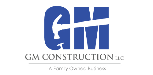
A simple logo using negative space for GM Construction.

Altimco Investments Ltd is an investments consulting company based in Athens and Nicosia. The concept of this logo is the “handshake” between two people, the consultant and his client. As a result a friendly and eye catching logo was created that connotes trust, accuracy and professionalism.

black cat mark / logo https://dribbble.com/Aditya-Chhatrala

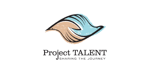
Unused proposal for an education-based initiative to reconnect with participants of a 50 year-old national survey of high school student aptitude in math, reasoning, and language. The current initiative aims to share these participants' stories from the past 50 years, and the collected data could be used in a variety of academic, economic, sociological, and health-related ways.
This mark is steeped in uplifting, motivational symbolism. It's constructed such that it could represent two hands clasped, two birds in flight, or even one hand cradling or releasing a bird. The hand-drawn line quality, typography, and offset color evoke a nostalgic '60s feel. Unused proposal.


HOWLY is fresh modern dynamic brand with short easy memorable name. It will suite well to any business or industry.
Eco farm products from milk and meat.