Most viewed logos – Page 163

It was a rainy day here so i made this for fun :)


Unused Proposal for an art studio specially for kids

Garden company www.gardenika-lubin.pl

Just something i came up with during practice

This logo for fabric factory
Logo Super Baby

Logo for electric wheel brand

Ekids club is an English club for kids ranging from 3 to 11 based on Hai Phong city. Play to learn. Facebook: https://www.facebook.com/ekidsclub http://kanipoly.com/portfolio/ekids-club/

Devilboy concept.
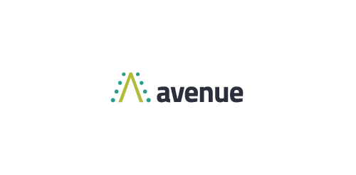
avenue is company which is advertising various products.
My logo shows reaching one target (better sell of given product) in few kind of way (few kind of advertising. All in 'A' letter.
Ready to work - pkowal98@gmail.com
My format. Music club

Imkerei Wojciechowski is an apiary from Austria. This contemporary geometric linear logo for an apiary reinterprets in a fresh way symbols common in the apiculture trade. The image of a bee emerges out of intersecting hexagons of a honeycomb. It creates a layout, whose aesthetic strength lies in the logic of construction. The logomark is complemented by the brand name written using an original angular typeface.

Logo design for an personal and property protection company, Hungary.

Logo for a bridge club. Composed with 9's and 6's, together present table with four seats for players.
Logo for company that provides management solutions for small & mid level companies. The brief was to create stable & smart mark with the name. So I found a way to do this by expressing businessman icon just with the initials.

Logo for a traditional Turkish coffee-house chain. Looking for an item I noticed the traditional Turkish Fez (turkish hat) in the form of a truncated cone which flipped will guide our mind to a cup of coffee. Along with this unmistakable Turkish element, Turkish mustache is part of the image of this nation too. Combining these two elements the graphic logo was born.

A brand of cowboy boots. Western Boots for women.
I decided to challenge myself to create logotypes everyday with random words.
House Logo
Logo for keratin studio..
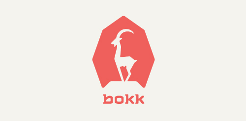
I recently realized I've never designed anything animal related. So I decided to give it a try with this ibex. The logotype was custom made and incorporates characteristics of the ibex. (The name bokk is derived from the word sprinbok.)
Logo