Highest rated logos
Most rated logos – Page 362
Quentin James Design is an honest, hard working, creative website design & graphic design agency in Preston, Lancashire. We are committed to creating positive change for people, companies, and communities through better design.


Logo for a Dutch full-service internet agency.


Logo design for an Asthma COPD association. The green resemble a lung.
Redesign of a logo for craft brewery from Kent, UK.
Logo design for a safety consultant company (New Frontier Safety LLC) the oil and gas industry. Specializing in Safety Leadership and Coaching, U.S.A.
GENERAL CONSULTING
In concept and creation, we wanted to bring some continuity with a previous circular logo design, but incorporate the North Coast element too.

https://www.behance.net/gallery/9624461/AAMM Creación de identidad corporativa, branding y papelería comercial 22 de Agosto del 2005 queda constituida como” Asociación de Artesanos Microemprendedores de Mendoza”, como Asociación sin fines de lucro. Para nuclear y fortalecer la actividad de artesanos y microemprendedores, mejorando su calidad de vida.

https://www.behance.net/gallery/31088181/ADRIFT This brand has as strategic goal, to represent and communicate through a set of visual signs or identifiers the prestigious shop Adrift. It intends to position itself among the top 5 five best brands in the world, represented by the quality of its products and the personalized attention. Transmitting a concept of constant growth and innovation to thus become unique.

https://www.behance.net/gallery/34442955/Spiritual-Wisdom-Americas «Spiritual Wisdom Americas nace en la Montaña Sagrada del Ausangate, Perú, en Julio 2011, en un viaje de búsqueda de visión, donde en cada paso hay un diálogo directo con la Sabiduría de la montaña y sus Guardianes»

https://www.behance.net/gallery/40556041/Interespacio- INTERESPACIO: based on the characters of (I)nterior and (E)spacio + celosia. The study came from Mexico. Three years ago, as first instance began with interior design and architecture, then we got and started working professionally. Throughout the time we moved to Argentina and the idea of opening our own trade and professional studio. We needed a nice, comfortable place for people to know us a little more and we could show our knowledge in: products and services
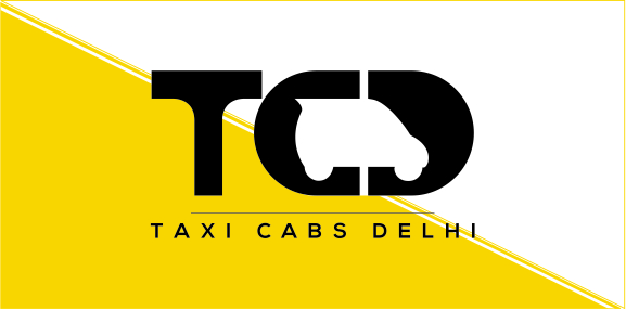
A car rental company in Delhi, Taxi Cabs Delhi provides a full-fledged, low cost and excellent taxi and cab services all around Delhi. A fleet of cars and SUVs of almost all brands like Mercedes, BMW, Ford, Ambassador, Tata Indica, Toyota Camry, Tavera, Maruti etc. are included.
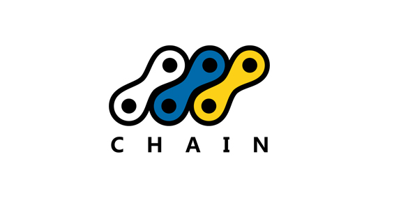
Chain logo foro a bicycle store! Feedback and support appreciated!
We created a logo that present a proud figure of Polish hussars rider. Due to the purpose of the logo, which is related to embroidering it on clothes, we focused on minimalism. The logotype has been presented only the most characteristic elements of the hussars or a horse and a helmet with wings. Thanks to that we avoided the splendor that disturb the brand communication with the client.

Cake company based in Krakow
Logo for the foundation.
PR & NEW MEDIA SOLUTIONS

Furie Lublin - womens american football team
Logo for Internova.
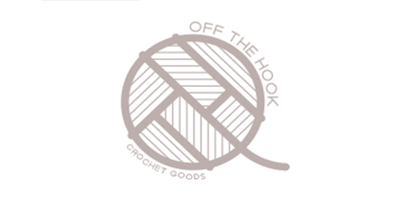
Crochet Goods from Cape Town South Africa
Concept Design for the South African Waterpolo Association

Beauty Bar.

Handmade wallets.

Audio Studio.