Highest rated logos
Most rated logos – Page 348

Logo for pet store specializing in the sale of fish


A positive logo that depicts a sun in the negative space making it's way through friendly clouds!

Professional logo for a water and plumbing company. The icon has a tap with a water drip. The pipe also forms a P. This adds a clever touch to the logo design. The blue, black and white colors make the logo look very vibrant. The font has a pipe like feel which adds to the concept of the logo design.
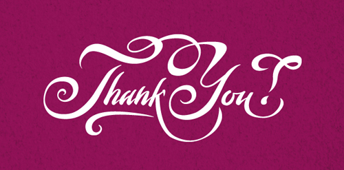
Calligraphic lettering.

pomegranate juice

As an architectural enthusiast, my architectural manifesto explores the synthesis of life in materialized form. It is the agglomeration of ideas being in a phenomenological context. Inventive approach drives me intuitively into uncovering unexpected branches as illustrated in the representation. Golden ratio is employed to invigilate the actualization of the notion.
'As agile as a monkey' is the way the owner of this small advertising/design agency described his company. The logo portrays humoristic approach in contrast to a serious tone of color.
Logo and visual identity of Africa Innovation Syummit designer: Salif Silva client: Ihaba Building Enterprise Inc. This project was developed as part of the communication and promotional strategy of Africa innovation Summit .(www.africainnovationsummit.com) The purpose was to create a dynamic image and show the diversity and multiplicity of innovation in Africa.

A Visual Communication Company, based in the United republic of Tanzania. Http://www.emagod.com
Calligraphic lettering.
Unused proposal for holistic centre.
Lettering for calendar of The Birds.
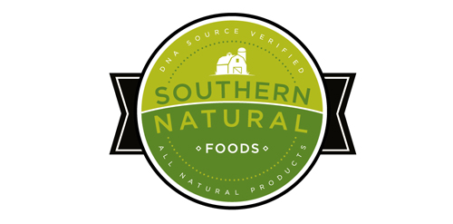
Logo design for Southern Natural Foods
Calligraphic lettering.

This is a logo for Star Zone Company Limited.

Web&Mobile Development company
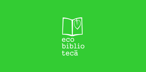
logo design for the green library of Cacica | Romania

logo concept for KIDDIES, baby and kids outlet.
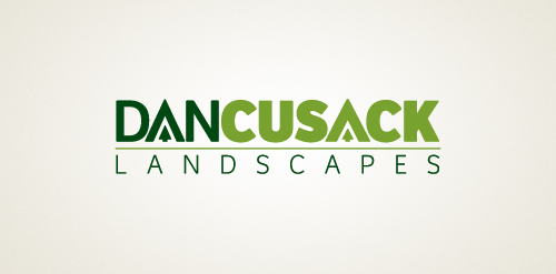
A local landscape design small business located in Canberra, Australia.

Wine tasting http://ekran.in.ua/

Designed by www.logodesigncreation.com

Lettering for calendar of The Birds.

Lekkerwijn.be means in the Belgian / Dutch 'tastefull wine. The logo symbolizes a wine bottle, a sunset and two rows of vines. The 2-colored rows of vines also visualize the bottle label.
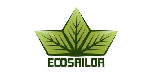
The logo is suitable for green and environmental businesses. You can download the logo design concept here : http://freelogosdownload.com/free-environmental-logos-download