Highest rated logos
Most rated logos – Page 303

wedding event planner


Just for fun.
Max design

ARCH ATELIER is an architecture and interior design studio based in Damascus, Syria. Formed and ran by a group of young architects who carry big dreams to establish their atelier into a global brandmark. The logo uses the initials of Arch Atelier, with negative space. The two "A"s where transformed into triangles that act like arrows upwards, which is the core concept of architecture, building towards the sky. The negative space also helps to give ascending harmony to the logo, which resembles innovation.

Turnkey marketing solution for dental practices.

Logo for fun! :)

Logo developed for Trevo International (Importer/Exporter company)
At Explainer Videoly, we don't just make animated videos. We bring your product, service or idea to life with a creative and engaging explainer video that promises real results, which means it will help you generate new leads and ultimately, more revenue.

The company specializes in the production of high-quality photo albums. The offer is addressed mainly to professional photographers.

Erotic toys.

Music Label The harmony of the simple shapes used, the color chosen, makes clear and direct the concept behind the brand: the union of the sun, represented by a flame, more, the empty spaces game of the treble clef.
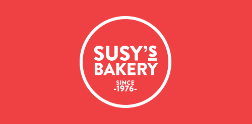
Susy’s Bakery ® is a premium quality bakery and food retail space founded and established by Azucena Romero Camarena since 1976 in Guadalajara, Mexico. The corporate identity is directly derived from the profile of the company: a small business which bakes signature gourmet cookies, cakes, cupcakes, pies, and choux, priding itself of having the best homemade touch of the region. Susy's Bakery’s packaging is quite simple and very easy to apply; we use parchment paper to wrap the different products, which is printed with a pattern of pictograms specially designed for the brand. Circular stickers are also printed with pictograms to stick on laminated packaging; finally, when delivering the client their purchase we use recycled paper bags printed with different designs, each made for small bags and for larger bags.

Is an establishment dedicated to the sell and preparation of speciality food and coffee. They know the place where the coffee grew and the different procedures are realized to obtain a variety of flavors, smells and acidity. In the part of the tea we work with one of the best houses of tea in the country named Carabanserai, located in Roma D.F., they provide french tea and realize their own mixtures of excellent quality. By our part we realize the redesign of their identity where we look to keep and stylize the main elements of their old logo, as the top hatted, the gentleman’s mustache and the cup of coffee, the result is a clean logo, sophisticated and with an european tendency, to give the classic touch on the composition of the new identity and unique consume experience. On the packaging we use ziploc type bags of rice paper to keep the freshness of the tea and also the coffee, and we tag with two stickers, one with the illustration of coffee beans and another one with the picture of a cup of tea.

CastedCare provides onsite support to cancer patients. The logo uses the memorial ribbon with two hands in a supportive form

logotype for beauty salon
InBest&Co (Financial Services) - (MEX)

A game controller device set as the hair of this cute japanese sumo wrestler.

"Handmade, Fair Trade, Global Gifts with Heart."

Video Production

Creatiph is the independent studio of Transylvania based User Interface and Brand Identity designer, Marian Pop.

Mobile MAFIA

New logo for TT BVBA, a Belgian specialist in the field of windows and doors. In the logo are a window and door shown, but also the initials of the owner.

custom lettering for fun & for sale

Chit Chat mobile messenger logo