Highest rated logos
Most rated logos – Page 251
Logo of an autism association


This logo is about a network & security agency.

Running shopping bag is followed by a customers mouse pointer. It suggest the addiction for shopping and how easy is to buy online. In the same time it will show your customer that your site is the best place to shop.

Company from Poland which perform faucets and accessories.

A fun take on the word terabyte and use of the word monster to imply "large" storage space.

This effective name and logo is right stuff for commercial and documentary movies and production.

Just for fun
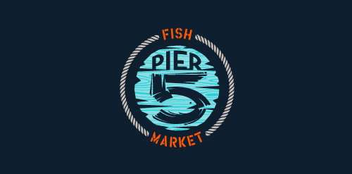
This logo is for a completely fictitious fish market.
The idea came to me when I discovered that it was possible to achieve a fish shape in the negative space within the bowl of the number 5. Dubbing my hypothetical company Pier 5 Fish Market, I created this illustrative mark in the hopes of really capturing the spirit of the nautical and maritime aesthetic. Type is custom for "Pier" and also the number 5, which is hand-rendered to look like it was painted on a wooden sign with a very wide, worn-out, thick-bristled brush. While it was important for the fish to show in negative space, it needed to look like a seemingly happenstance result of logical, real-world brush strokes. This is the minimal, alternate version of this logo.
Click here to see the case study for this logo, which chronicles its development, and includes full design rationale, sketches, electronic roughs, and alternate designs.
Logo for speech center.

Logo for IT company

place in the network to the presentation of projects of eco-architecture http://www.facebook.com/yaceky

Logo for consulting company
Logo for Twin Sister Publisher (unrealized)
Perfect logo for creative agency, corporate, printing house.

Logo for english language school. More on behance: http://www.behance.net/gallery/Extra-English-language-school/8600383
Logo for creative company.

Galaxic- music and video clips search custom type http://www.facebook.com/yaceky

Sreca je u nama (Happiness is within us) The brief was to create logo for life coach and art of living workshop "Happiness is within us" and to use posture that symbolizes happiness. www.lifecentar.com The idea Happiness posture + butterfly + tree The logo is combination of asana that represents happiness presented through the symbols of butterfly and tree. Butterfly symbolizes change (metamorphosis), and in Japan is considered to represent one's soul. Tree symbolizes stability, longevity, and strength. Connection of mind and body is shown through these symbols. Energy vital points on the body are colored in gold: feet, palms, heart, third eye and point below navel.

Logo for wine producer.

Logo designed for secret revealing website.
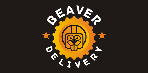
Logo for beer delivery.
Logo for design company.

Colourful Days (Chromatistes Meres) is a company active in the field of experiential education, with programs for children as well as training seminars for adults. The programmes, divided in thematic circles are designed by specialist educators – animators, and cover a variety of educational and entertainment-related subjects. The target is the high quality of the end result. Every programme is experiential as well as educational. Built around theatrical games, it accomplishes its target through games, constructions and a lot of imagination, providing to children the opportunity to play, to express themselves and to create. The logo, inspired by the ‘circles’ of the programmes has been designed so as to express joy, playing, movement through a mosaic of colours and experiences
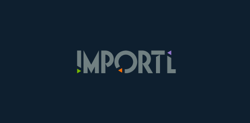
This is a logo for a completely fictitious entity named IMPORTL, which could be an open source web development site, or some type of developer software.
This wordmark features triangular facets — symbolic of the flow of data — that point inward toward the name, reinforcing the namesake.
The mark employs a custom typeface that compliments the triangle shapes.
Click here to see the case study for this logo, which chronicles its development, and includes full design rationale, sketches, electronic roughs, and alternate designs.