Highest rated logos
Highest rated logos – Page 89

New logo created for a restaurant specialising in seafood, and playing of the seafood theme by creating the initials from fish hooks.


Aniversary of the portuguese ship "Sagres". In 2012 the Portuguese Navy is going to celebrate both 50th and 75th years of the ship.

logo for travel agency.
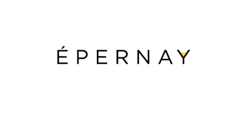
French Restaurant logo in New Jersey

Logo for interior designer/stylist Susie Herbert Light depicting house martin bird.

shoe store
Some experiment about verbicon, i hope you like :)

Unused concept for a client. Custom made calligraphic logotype.
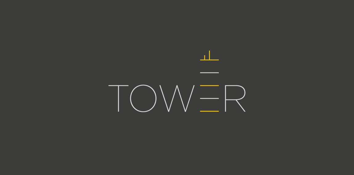
Logo for TMVectors

Logo for the company, or rather the workshop, which builds bikes the old-spiders. Penny-farthings. (wrong year)
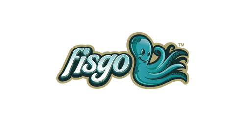
Fisgo Logo

Logo is a simplified ink splash, kangaroo and Australian map.

manufacturer of perfume for men 4fun

Aquarium Plus — Plant, Fish, Design

Galaxic- music and video clips search custom type http://www.facebook.com/yaceky

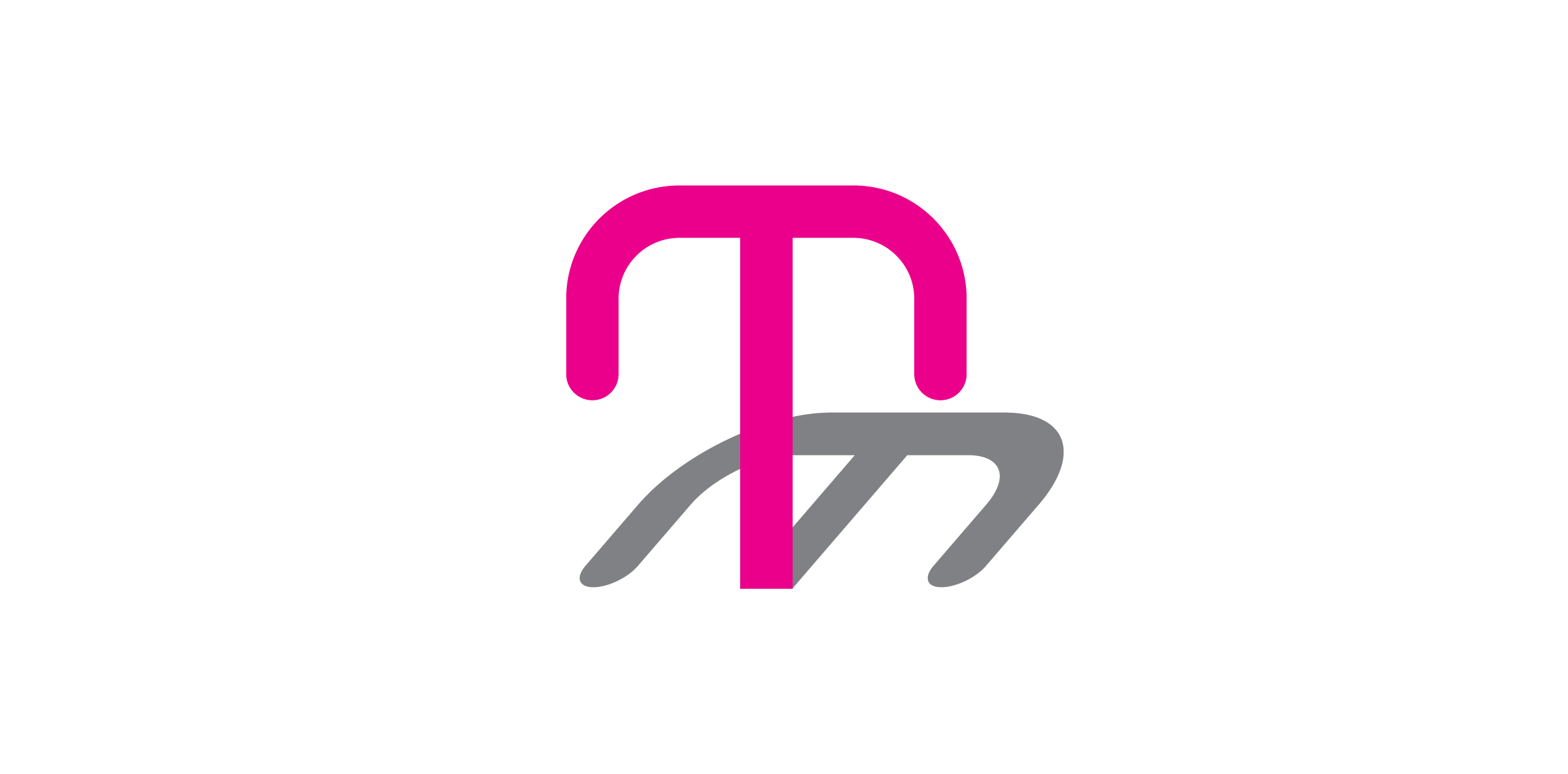
First letter of first two words of the name - letter "M" made using pet silhouettes. Unused concept.

A brand of www.cubicus.mx

A person meditating. An unused logo proposal for a health center. This is for sale.

I created this design for a very well-known technology company.

Avesta Films production

The mark shows an eyedropper containing an antibiotic interjected into a bacteria.
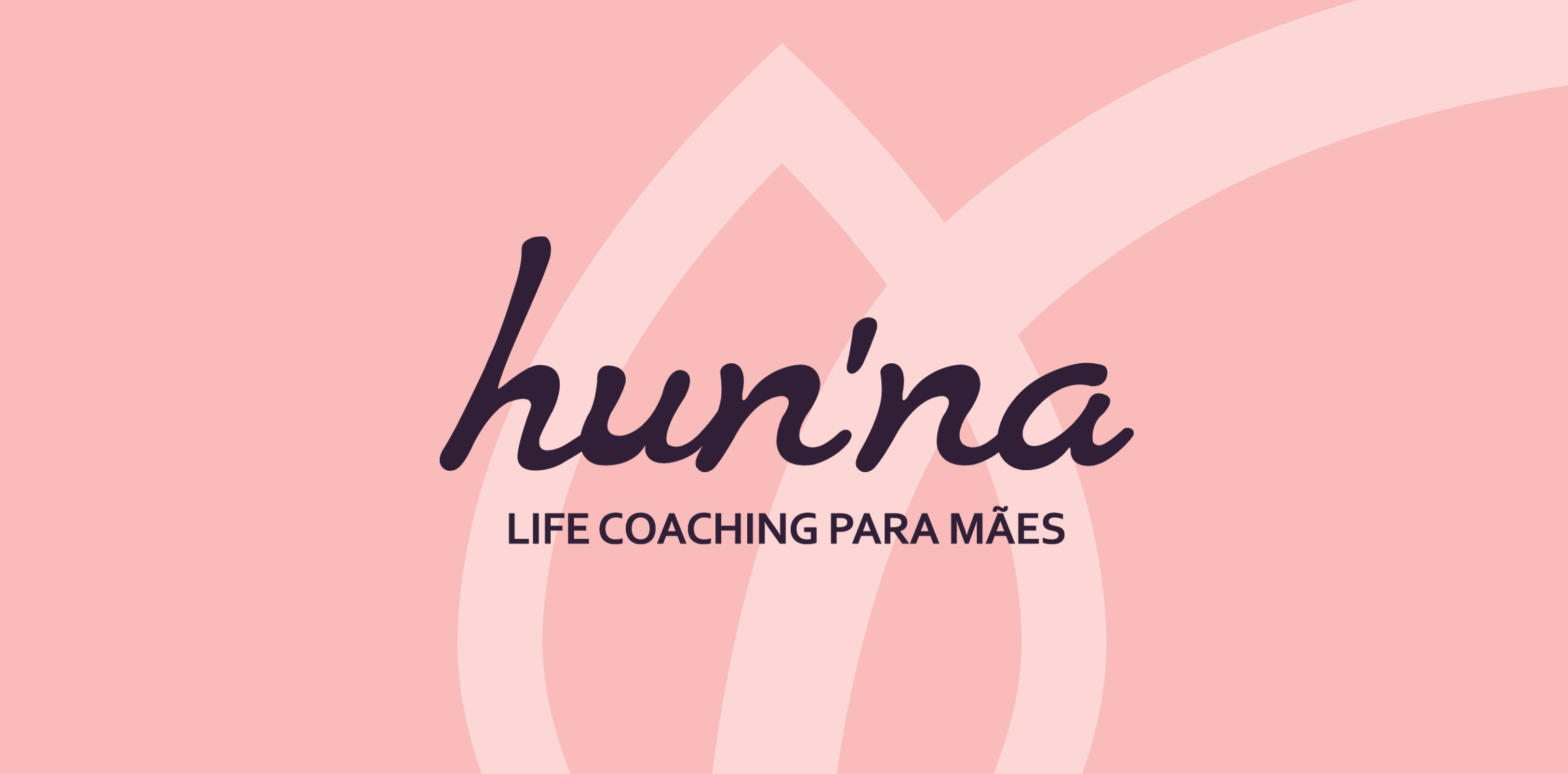
logo for a life coaching firm based in brazil.

Approved logo for expose. The type is created from zero. I went for a rounded approach to communicate a friendly and inviting feel. The mark symbolizes abstract light beams forming the expose action coming from the edge of the "e" The red/green/blue color stands for light and yellow/orange/red represent the levels of sound volume.

Logo for travel agency.