Highest rated logos
Highest rated logos – Page 75
Terra Magica offers a number of unique trips to different parts of the globe.


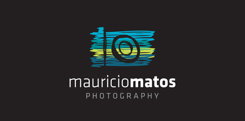
A new logo for a travel photographer.
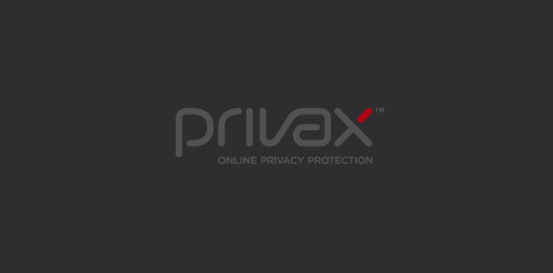
For a VPN Service (virtual private network) named Privax which helps secure your internet connection + helps protect your online anonymity through encryption. Custom made font. The concept: the x symbolize an abstract protective shield with which you surf anonymously, the red bar is the outside world / hacker etc...

dead concept

.

I just couldn't think of anything more accurate to the theme like this.

Logo for publishing company.
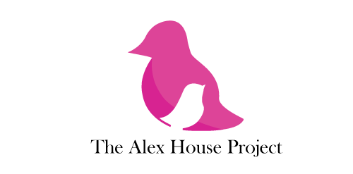
The Alex House Project is a multifaceted program designed and led by young mothers to increase long term self sufficiency and independence by providing parenting and leadership development in a safe and caring environment.
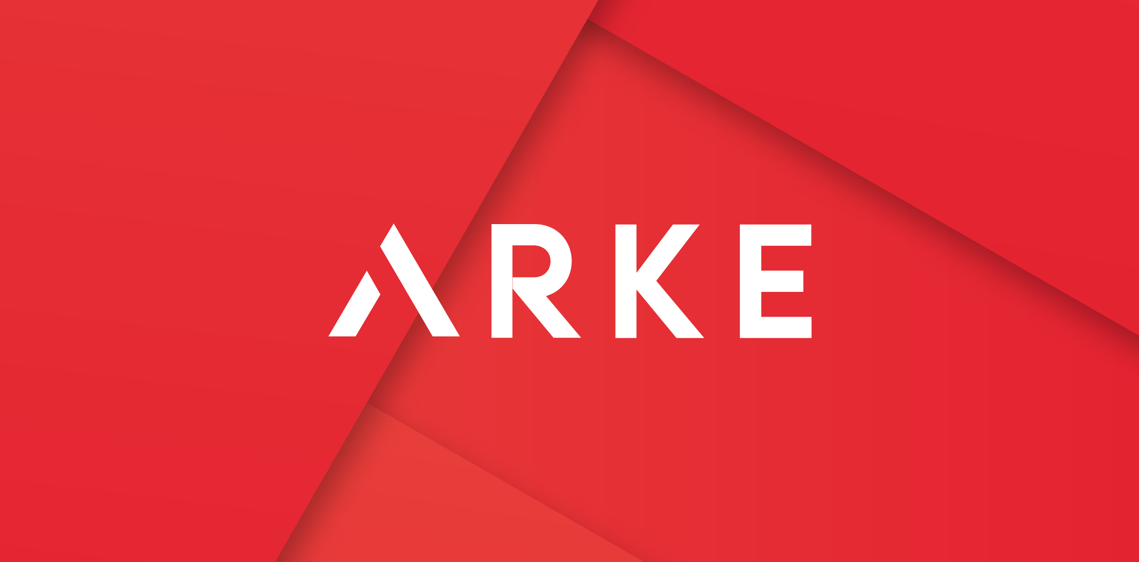
Arke is a startup focused in sportswear for sportswear line for Paralympics athletes. For more: https://www.behance.net/LucasCassim

A quirky font and soft colours combine to make this childish sweet logo. Perfect for a candy shop!
Rockstar

Website that sells personalized chairs for kids.
A simple and effective logo, a seahorse shown in an unusual way.
A proposal for Webomeb.com Both "web" and "meb" words in Persian ("وب" & "مب") are used in the structure of this logo.

Pear is a cloud-based application that integrates entertainment, fashion, travel and sport. Allowing users to have a customised interface to the web that streamlines and aggregates only what interests them. The logo encompasses representative icons from various genres and sectors and combines them under one pear-shaped roof, just like the app itself.

The finished logo for Poplar Creek Brewing ... a retail store that sells ingredients and equipment used to brew beer and make wine at home.

Production of chemicals for cleaning and disinfection
Crane flying against the sun. This logo works for a wide variety of businesses. Logo for sale on BrandCrowd. http://www.brandcrowd.com/logo-design/details/107368

Finishings materials for repair.

ideris is a small company full of web 2.0 ideas.

Personal logo for a photographer

Logo design for brand CUONGARDEN

Logo for library located in an old tenement house on TwoPoint Street

Simple C.