
Highest rated logos
Highest rated logos · Page 72

Done for fun


Mark concept proposal for small family business Perga+. A company engaged in the bee bread "Perga" production and trade.

Some experiment about verbicon, i hope you like :)

Genetics logo showing a string of DNA under construction. Unused proposal. For sale.

Skyrocket Marketing
Incubator
Childcare Business
Logo for fish restaurant.

Logo design for a web store for geeks.

Logo for interior design studio "I am Home"

This company exporting agricultural products...

Logo for the event - bowling tournament a steady advertisers. logo for this year's event (2012). We decided to abandon the standard picture of balls and have fun logo, because the play will be creative people.
More information about the project last year:
http://gladhead.com/#837331/Advertising-Bowling-Cup

One of my older designs but still one of my personal favourites. Logo was for a financial planning company.

The Writer's Vantage manages a writer's day to day business tasks saving the writer time and allowing the writer to focus on writing.

Simple combination letter "H" + mustache. Great for barber shop or haircut men shop. Logo is for sale. For more information pls contact me on E-mail: miko@mikodesign.sk Thank you

Running Deals.. Thought to show the running in the form of letters..

Lettering for calendar of The Birds.

golf
code concept typo
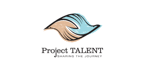
Unused proposal for an education-based initiative to reconnect with participants of a 50 year-old national survey of high school student aptitude in math, reasoning, and language. The current initiative aims to share these participants' stories from the past 50 years, and the collected data could be used in a variety of academic, economic, sociological, and health-related ways.
This mark is steeped in uplifting, motivational symbolism. It's constructed such that it could represent two hands clasped, two birds in flight, or even one hand cradling or releasing a bird. The hand-drawn line quality, typography, and offset color evoke a nostalgic '60s feel. Unused proposal.

Form movie maker

Search Engine Optimization

Logo for a vegan restaurant.

Producer of timber houses.
The client wanted to emphasize quality, nature, beauty, uniqueness, trust and avoid references to traditional symbols (roofs, doors, windows, buildings) used within this industry.