Highest rated logos
Highest rated logos – Page 65
Logo design for the graphic design studio called 'nekarstudio'.


Branding company

Strawberry Assurance is a consultancy firm specialising in risk assessments, security, installation and disaster recovery of IT systems and networks. The logo mark was constructed using triangular shapes to represent the 3 point process in which Strawberry Assurance operates: risk assessment, undertake required tasks to secure IT systems and provide in-house training to the organisation where applicable. The bold angular shape of the mark combined with a carefully selected logo type and colour palette provides the company a with a powerful and authority presence whilst remaining friendly and approachable.
Beast Mode - Brand design excellent for many types of industry such as clothing, energy drink, carbikes accessories, sports gear etc.

Brand mark / buying & selling excess inventory // www.pacholczyk.co
Natural Selection

Logo for Adelaide airport
Sixth Saving Operation - S + O + 6 in one symbol

Finance.

Flower Store.
Logo for paiting company.

Smart Repair is a directory for nearly all companies serving the german smart repairs market. Within the enduser can find the most nearby specialist for his problem and also lots of informative tips and tricks, articles, glossary etc. about smart repair.
BYOLA.com - fresh, bold and green brand.
Custom typeface design.
more at: http://RadekBlaska.com
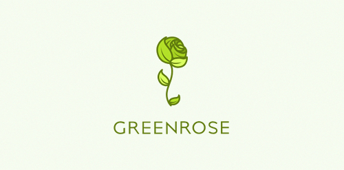
An eco friendly/fresh/green logo. Logos main accent is a green rose, that is made out of many leaves. Logo is still available.

Logo for design bureau

Warranty Finder

Beautiful logo for cafe or coffe shop. For sale!
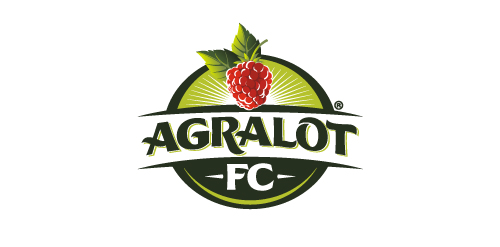
Logo created for a Berries production company

Just for fun. If anybody has seen something similar please let me know. Thx.

Customizable Ready Made Logo Design at http://wp.me/s4571j-eaglemon
A logo depicting two animals: a mammal in the positive space of the design and a bird within the negative space of the logo.

Logo for "ROWERUS"

impotent concept typo

Logo design for clothing brand. Target audience men 15-30 who are probably athletes, in fraternities, and like to drink and party a lot.