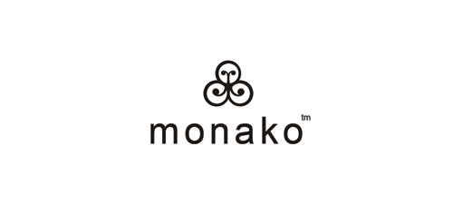
Highest rated logos
Highest rated logos – Page 56
Brief from the customer, Søren Lindhardt, Onmondo: “Online marketing is all about connecting. Onmondo is a fullservice online marketing company, and we are working hard to help our customers to connect with their potential new customers. And thats exactly what til strokes and the circles in the logodesign symbolizes”.


STRIX is fresh modern dynamic brand with short easy memorable name. It will suite well to any business or industry.

on-line jewellery store
Applicable for multimedia and creative designs such as three dimensional movies. Also for computer graphic application and game developing application.

The intellectual role-playing games club
Logo for internet new retailer selling on domain name SHOES woman and men shoes.
The same company as "Entrepreneur Express". Offering marketing mentoring. "Discover the power of Mastering the Secrets of Marketing to Improve and Grow your own Business" www.mastermarketing.co.uk

A 'just for fun' logo design for TnT Personal Training.
Done for fun

Ecotourism in Ukraine, Crimea.
simple iconic design
Logo for Fiber Novelty
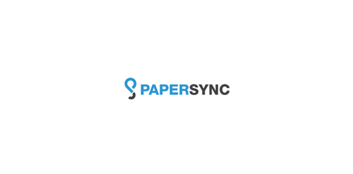
Combining the letter of “P” and the letter of “S” to be the logo.
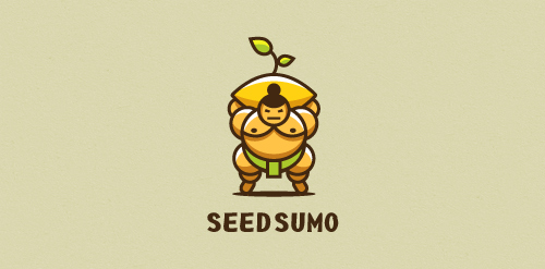
"We are a mentorship-driven seed accelerator. We look at hundreds of Startups a year and only choose 10 that we give $20,000 in funding (seed) drown them with mentors and advice and prepare them to pitch their startup to dozens of investors to take them to the big leagues (sumo). " Unused proposal

....

logo idea with king

Logo for a company in exotic handmade fabrics

Conceptual logo. Logomark represents idea,inspiration,farm,sunshine and growth.
Consulting Firm
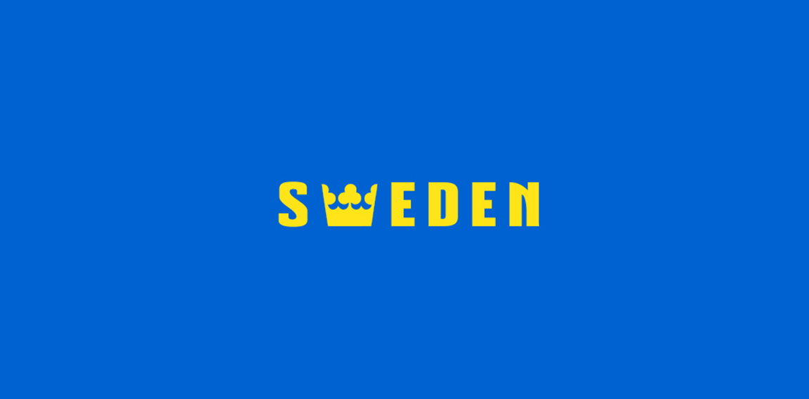
Country names , logotypes
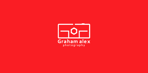
Graham Alex is a photographer and has recently opened his studio in Birmingham. He named his studio Graham Alex Photography. They hired me for branding their business. They want an identity that is creative and will be relative to their industry. I present four identity design concepts, they like the following one. In this logo camera represents, “photography” and GA are initials of” Graham Alex”. Camera and initials are merged to form a creative unique identity.


Exclusive Customizable Logo at Eisaks Logo Design.

Unfinished project for a technology company.