Highest rated logos
Highest rated logos – Page 396
.


Designed by www.logodesigncreation.com

#1 in a set of logos for short-run prints on caps, t-shirts, etc.

In addition to my day job as a graphic designer, I am a choral composer. This logo was designed to represent those interests.
Logo for photography company.

it's a fluid-like logo because the website is all about after effects and motion graphics... I choosed fluid because it refers to motion and like that it can be easily remembered.

no more lazyness in conform couch, go out there! find something usefull for your life. (motivation)


S Bernard

Wedding Photographer
Logo for http://pixotico.com Main focus was on minimalism and simplicity.

a logo design for film making company

Pharmaceutical company

Logo for video studio

Logo design for illillill, 2010.

Skin Suite - skin clinic making skin looks younger
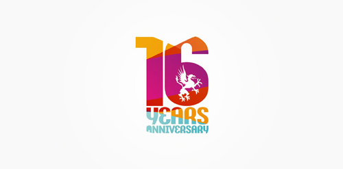
16 years anniversary of Studio Martin club.

French BIO company
new "skipping-rope" logo for http://skakanka.com.pl/
This logo for my Business. illustrator
Dental Science Institute

DTU TV
The logo that I drew

This is a logo for a store selling stationery and fashion I want to use gentle modern font. the highlight of the logo are trademarks price