Highest rated logos
Highest rated logos – Page 335


"This project is about a brand of a psychologist that works with business education. For the idea of this brand, we studied psychology, the human behavior and the cyclic idea of improvement. During our study about the client’s work, we understood that psychology is the science that studies the mental processes and behaviors. With this in mind, we developed an idea that would show the change and difference of the human being after going through this process. The colors used by the brand are clear about the improvement and humanization of the person, because we used a simple and objective melody with a salmon color and navy blue. ”
The logo that I drew


3D Architecture Visualization company

GREEN POWER is fresh modern dynamic brand with short easy memorable name. It will suite well to any business or industry.

Nonn's has been in business for thirty years, we updated to a more upscale image to show the diversity with the brand and interior design service. The icon works together or separate.
The inspiration of the identity of this construction company was the actual foundations of a building under construction.
A 3-dimentional symbol was created based on letter “T” (The initial letter of the company’s name) as the base of the construction, expressing the company’s values, such as trust, accuracy and professionalism.

logo for a professional company in home and living equipment

Unused logo design proposal I did in 2013. For Sale!
BR monogram created out of bits.
This is a logo of SoftProdigy which leading brand for IT Services like Software Development, Mobile Apps development, Web designing, internet marketing & so on.

an establishment providing women amn men with services to improve their beauty, such as hairdressing, manicuring, facial treatment, and massage

Official logo for Mango Studio

Issue of loans online. Quick and easy! "Lightfin" - a derivative of the "light finance". See all project here: http://www.behance.net/gallery/Lightfin/11482207
This logo depicts a box without a top. It's symbolic of the ineffectiveness of services offered to homeless across the USA.


for fun

Dumma Branding is the design house of Duminda Perera. Duminda is currently involved in an ongoing logo project for design every day one Original, Clever, Wordmark/Verbicons or Negative logo.

As its name suggested, (Noah’s Ark where the animals were sheltered and protected from the big storm), This cafe in Ipoh is giving free foods to street ministry, and the profit will goes to children home as well. Logo designed based on noah's ark which i have twisted the sheltered on the ark to coffee cup. And there are cow, goat, chicken played around the negative space. Which is to strengthen the meaning of the logo name.
A round logo with the letter Z incorporated. Can be used for any type of business or service. Want to buy it? This logo is for sale at suitablelogos.com
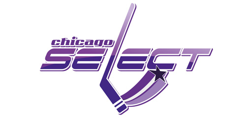
Unused proposition in contest for chicago hockey team

Angel-Frozen yogurt