Highest rated logos
Highest rated logos – Page 29

Logo design for software for screen sharing with multiple mouse pointers


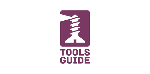
SCREW + LIGHTHOUSE Perfect for tools shop or tools guide. Original and modern brand. It is for sale!

Cafe&Restaurant
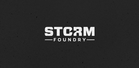
New logo design for UK based video production company Storm Foundry
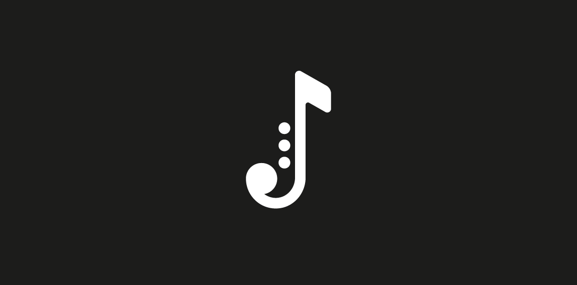
Single letter from marathon Logodays. J + note + saxophone = Jazz You also can buy it on shutterstock: https://www.shutterstock.com/ru/image-vector/jazz-music-logo-on-black-background-461586016?rid=3611111 More info about fast logos like this one here: https://fankin-a.myportfolio.com/logodays
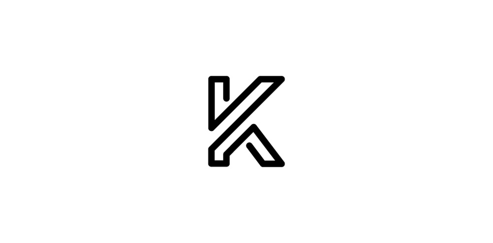
Monogram for letter K.
Conceptual logo showing a usb icon with cutlery.

Logo for King Fox Brewery

Logo for Old Irving brewing company
Logo for media company.
Conceptual logo mark.
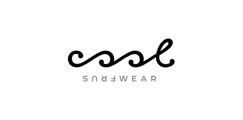
Typographic logo for water sportswear brand that expresses the waves & turning just like in the surfing.

.
One of my old logos restyled https://www.logomoose.com/featured/waterfall-2/
Mojito logo
Bioengineering logo

Coffee Bar
This logo is shaped as a letter G and is suitable for any freelancer, business or service that is modern and wants to stand out. The icon is very recognizable and unique. If you want to buy this logo, it is for sale at SuitableLogos.com

A game controller device set as the hair of this cute japanese sumo wrestler.

eudezet.pl
Logo for hostel.


Omnibus Film Festival. The logotype is straight forward. The rotating letterform embodies the persistent idea of collaboration. Each letterform is symbolized as a representation of a filmmaker. Filmmakers constantly keep changing every time an omnibus film is created.