Highest rated logos
Highest rated logos – Page 179

starcircle logo design


...
Logo for a Television Agency (+pr)

logo for an IT company

Logotype of jerry

Online Clothing Stores
Dance City (Šokių miestas) - Dance Studio Logo
Tuweley - {Tornado}
Brand Designed by Eduardo Andrade. The concepts for Velvære logo were Clean, Clinical, Relaxed, Organic, Soft, Friendly. Unique type makes it even more Professional and Original.
Identity for a small design bureau in Ulm (Germany).

This is a logo for a company that delivers low-energy LED lighting solutions.

Logo with no limits in use. For sale.
Unused proposal for new brand of caps with wooden parts.

INTEX is a leader in the automation systems training market, working uninterruptedly since 1993.
Scope of our work was complete rebranding of visual identification, including among other new logo and key visual design, photo session, website design and customer panel design.
Our cooperation resulted in consistent and strong corporate identity, which allows to easily communicate with the customer and what is also important it distinguished company from the competition.
Deer and Frog is a branding & graphic design agency which is based in Jakarta, Indonesia.
The Philosophy Behind The Logo
Many people view design and function as two totally different things just like deer and frog are two very different animals. However, we at Deer and Frog completely understand that design and function are connected.
This is why the logo is the unity of letter D & F which stand for design and function.
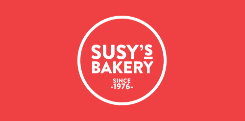
Susy’s Bakery ® is a premium quality bakery and food retail space founded and established by Azucena Romero Camarena since 1976 in Guadalajara, Mexico. The corporate identity is directly derived from the profile of the company: a small business which bakes signature gourmet cookies, cakes, cupcakes, pies, and choux, priding itself of having the best homemade touch of the region. Susy's Bakery’s packaging is quite simple and very easy to apply; we use parchment paper to wrap the different products, which is printed with a pattern of pictograms specially designed for the brand. Circular stickers are also printed with pictograms to stick on laminated packaging; finally, when delivering the client their purchase we use recycled paper bags printed with different designs, each made for small bags and for larger bags.

Sale of exotic plants

Emigo (from esp. amigo - friend) - electronics, mobile friend on the phone that allows you to manage of any area of business. 7th version of the software.
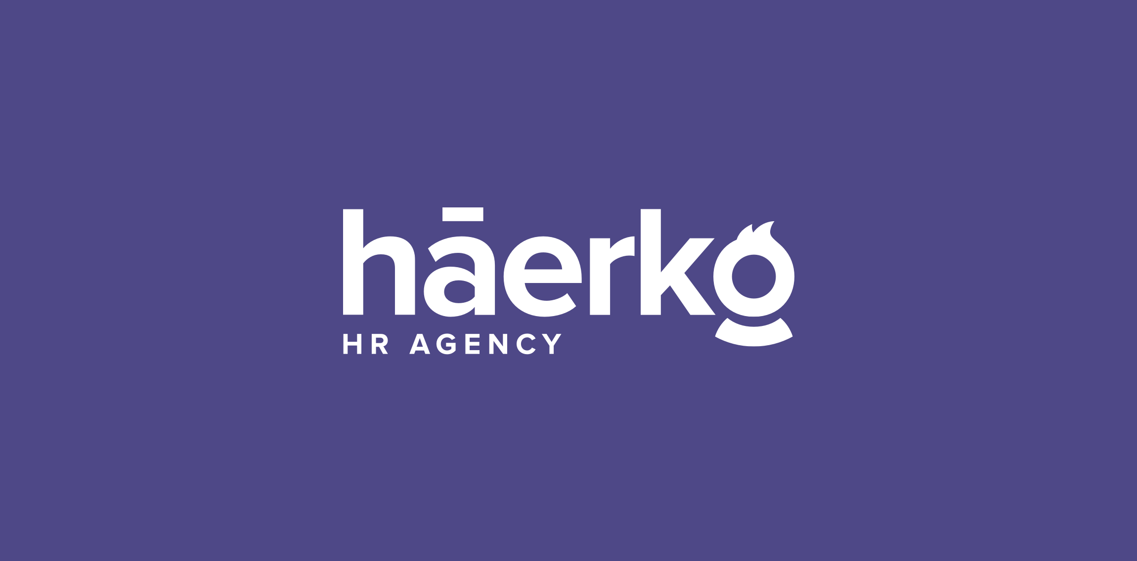
Hi everyone! My latest logo design for háerko - HR Agency. The point is the hidden men/women at the end of the logo. To be fair, I made multi-sex versions :) Check full version on my dribbble: http://bit.ly/1R8fp9v

Fashion Brand for kid

An old unused logo proposal for a women footwear company. Freshed it up a little, changed the name and customized a font for it.
