Highest rated logos
Highest rated logos – Page 136

Cube - meeting organisation


Logo for a distributor of floor coverings.

Lotusiana is an abstraction of lotus or flower, with geometric shapes.

Logo for printing company.

Accessories for cats a class premium

Ready made logo design.

fast food network
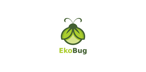
Grenn bug perfect for eco sector.

logo for Szeliga photography

A logo for a new beer hall in downtown NY.


This is our own logo designed for initially for this company. Idea behind creating this logotype was just to make it visible ad readable in its simplicity. Since the name CRAZYDES evolved from CRAZY and DESIGNERS , we were keen in making it simple and easy for everyone to read upon. With this thought in our mind, we had created this logotype with the crazy Y letter in between the two words.
Skate-influenced brand identity for a clothing line called "Hiromi (宏美) VM (Visual Media)". The reason we decided to move on from this design was because it did capture the skate mentality and feel, and it looked nice, BUT it didn't quite capture feel of the "slim, sleek, futuristic, chic" brand the client was going for.

Rebranding logo New York Blaze

Ready made logo design.

Unused proposal for an entrepreneurship training program.

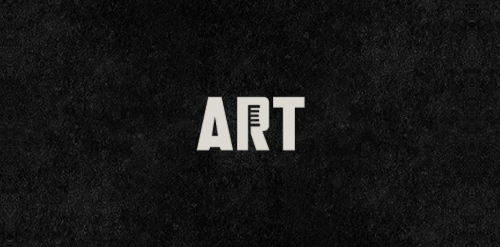
Art projects using toothbrushes.

Beltway Brewing

Restyle for a young agency


pet's store

Industrial Design , Graphic Design , Photography .

Design logo for breeding of english bulldogs.