Highest rated logos
Highest rated logos – Page 116

UFO


Abstract Logo

A mark is a combination of a seahorse, letter O. Some people also see a man's face on a backside of the seahorse.

Unused proposal for a snowmobile related company.
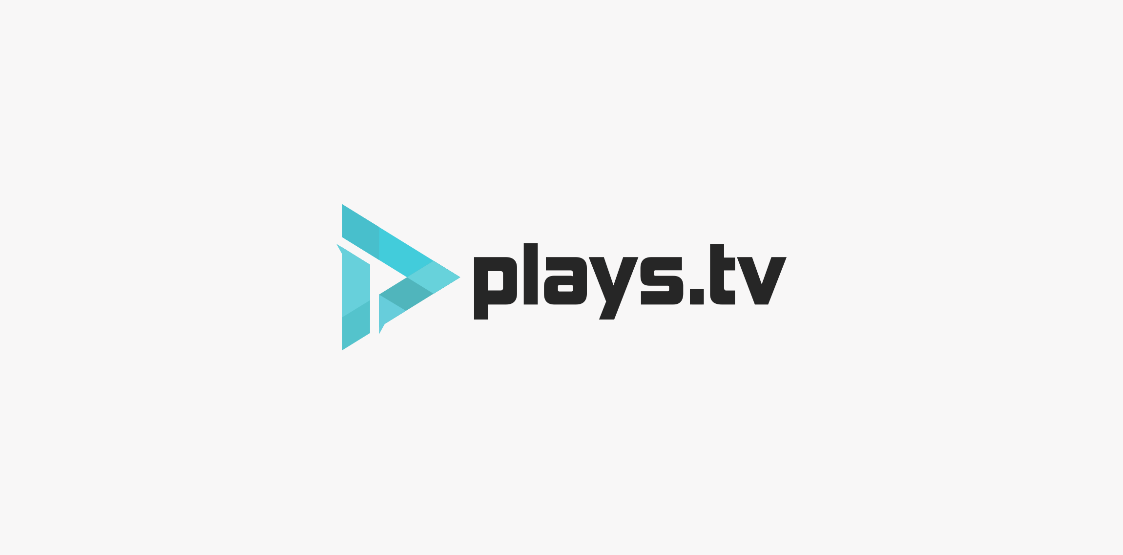
Here is a logo redesign concept for plays.tv. I tried to create something simple, modern but also keeping a bit of that gaming-ish style because that's what plays.tv is all about. The logo also shows the letter P inside the logo using negative space. Thank you for reading, if you liked how this project turned out be sure to leave a like! Ciao.

Logo for a traveling group.

Cheese producton

Exclusive Customizable Logo at Eisaks Logo Design

aditya26j@gmail.com https://dribbble.com/Aditya-Chhatrala

logo for fashion company

Artizan tea producer based in Canada. Client wanted vintage handcrafted style for start-up business.

Logo for Monica Kis's small café

Just for fun

Unique brand for icecream business. For sale!
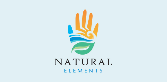
Natural and modern hand logo design with the hand created with the earth’s elements wind, water, land, sun and fire. The earth elements are beautifully incorporated into the hand design to create a seamless, distinctive logo design. https://www.logomood.com/downloads/natural-elements/

Children's trademark

Logo for a traditional Turkish coffee-house chain. Looking for an item I noticed the traditional Turkish Fez (turkish hat) in the form of a truncated cone which flipped will guide our mind to a cup of coffee. Along with this unmistakable Turkish element, Turkish mustache is part of the image of this nation too. Combining these two elements the graphic logo was born.

Foodmobile logo would be great for a food delivery company. It's fun and yummy. Animated version: http://www.dropmocks.com/iSyIb


Home Bar logo
Trade mark of children's clothes
Logo for a financial office.
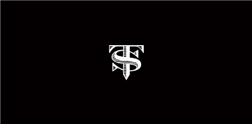
Proposal for TS (formerly named Top Streetwear), a youth fashion brand.

ZEAK is fresh modern dynamic brand with short easy memorable name. It will suite well to any business or industry.