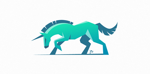
Porta Doors
Porta Doors

- Polish doors producer.
 Designer: Łukasz Ociepka
 - Submitted: 11/01/2012 • Featured: 12/03/2012
- Stats: This logo design has 8078 views and is 0 times added to someone's favorites. It has 9 votes with an average of 3.78 out of 5.
Designer
Łukasz Ociepka
More logo design
Numerissimo is a company located in Paris specialized in scanning, archiving and editing technologies, with a strong innovative and creative potential. Brand Brothers designed the graphic identity and branding, with a logotype that reminds technicality and graphic works in a simple, pure and creative spirit.
A small Catering company with 40 years cooking experience needed a logo and website that expressed the professional yet friendly feel.


