View portfolio
Advertising agency
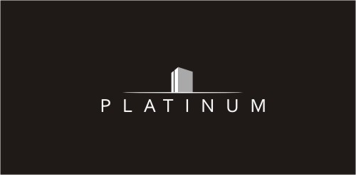
A logo for a real estate agency. Abstract and modern design was required.
Designed by www.logodesigncreation.com
It shows a man CLIMBing a pole.


 Designer: Mihai Ragea
Designer: Mihai Ragea
Designer: Mihai Ragea