Featured logos
Featured logos – Page 171

Rottweiler breeding logo. I wanted to represent that the breeders dogs are based on standards of A.D.R.K. (allgemeiner deutscher rottweiler klub). Important lines of the dog are bolded. The brown/gold color represents the color on rottweiler and also a champion/winner. Circle stands for golden medal.


for panoramic wiew project.
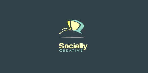
Logo design for social media management company

Identity project for a creative copywriter based in Santa Monica, California. The client wanted a bold wordmark that expressed innovation and creativity.

Titan Elevators needed a rebrand to showcase their offer. The logo was right under your nose; the up and down arrows of an elevator, simply made from the logotype's A and V.

Guiltwood are developers of exclusive residential properties.

A company situated in Romania providing consulting services for other romanian companies which are planning to extend their business to Russian Federation.
The name had to be clear and understandable in Russia. Parus means "sail" - a symbol of moving forward, development, direction, transport and logistics.

Logo design for a mobile app studio

The horizon brings about a reel of hipe while the red was used to depict a bright, glowing and rising organization

KlikaKlika satisfies the knitters needs

Deporte y Artes Marciales

Bruce & Co is a Scottish private bank with a solid reputation of having good foresight and future planning. The lion marque derives from Scotland's oldest clan- the Bruce Clan, with the motto 'fuimus' (we have seen).
for wood carved mobile covers.
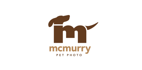
Logo for a local pet photographer. The client owns two Golden Retrievers, which were the inspiration for the mark.

Blogging about photography and stuff!

3d Style log for render design

Got bored at work.

Logo for astronomer and astrophotographer Yuri Beletsky. The brief was to show astrophotography, nightscape, mountains and desert.

Logo design for software for screen sharing with multiple mouse pointers

www.roshd.ir
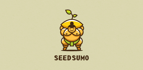
"We are a mentorship-driven seed accelerator. We look at hundreds of Startups a year and only choose 10 that we give $20,000 in funding (seed) drown them with mentors and advice and prepare them to pitch their startup to dozens of investors to take them to the big leagues (sumo). " Unused proposal

Logo for a film company specializing in restoration, preservation and telecine services.

sports and entertainment information economy Vietnam
Logo based on basic navigation symbol made for Outdoor equipment producer. the main idea is the logo is based on the known symbol, which show the right way in the outdoor nature.