Nemean Lion
Nemean Lion
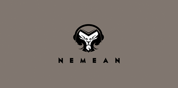


- Lion logo for an upcoming headphones and speakers co.
 Designer: Mario Strlek
 - Submitted: 02/06/2016 • Featured: 03/17/2016
- Stats: This logo design has 7127 views and is 0 times added to someone's favorites. It has 11 votes with an average of 3.91 out of 5.
Designer