LogoMoose
  • Logo
    Galleries
    • Featured logos
    • Most rated logos
    • Most viewed logos
  • Identity
    Galleries
    • Featured identities
  • Packaging
    Galleries
    • Featured Packaging
  • Designers
  • Competition
  • Upload
  • Become Member
  • Login

Munnes

  Munnes  
Munnes
Facebook
fb-share-icon
Pinterest
Reddit
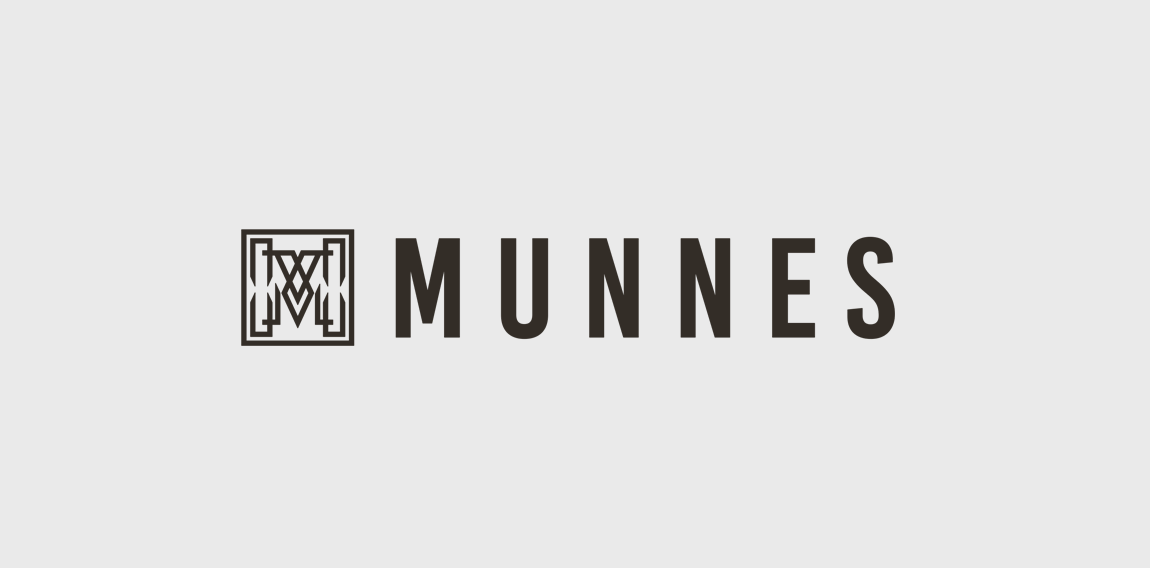
  • Munnes logo In order to highlight the quality, style and distinctive character of the Munne glasses, we have developed a logo that reflects all of this. He chose a stylish combination of an icon and a name. Using graphic details, we have created a unique and exclusive design of the character - the letter "M". The square contains a hollow letter, which consists of various graphic details and shapes. This style looks like a non-banal, unobtrusive, and eye-catching one. To keep pace with classics and aesthetics, we selected a combination of two colors, a white-and-white. It helps maintain the image of a neat, modern logo. We branded the brand next to the symbol. We chose the color of this dark brown, color. The brighter and "heavier" name of the brand has become like a counterweight, a dimmer symbol, while preserving the integrity of the style. Designer: gintautasbruzas
  • Submitted: 11/19/2017  •   Featured: 12/13/2017
  • Stats: This logo design has 5272 views and is 1 times added to someone's favorites. It has 3 votes with an average of 3.00 out of 5.
  • gintautasbruzas
  • Make.lt
  Designer  

gintautasbruzas

View portfolio

  More logo design  
Dabur

The age old Banyan tree which is essential to the brands identity was rejuvenated bith to showcase the brands heritage as well as to contemporize the brand. The green was derived from the category and the orange was used to show optimism.

dyworksComments1Oct-03-13
chilled wine

wine company

bobo88Comments0Aug-21-14
Acqua Piu

Logo design for a company, focussing on saving water and energy, based in Belgium.

dionwolterComments3May-12-13
Tetrphashe Marketing Consultant.

TETRPHASHE is marketing consultant company which needs a logo for their new business. They want a logo that has both text and symbol. So that symbol can be used independently when required. Symbol should have something relating to marketing. I designed the logo keeping in mind the design brief, in this logo the symbol is make of alphabet "P" which is revolve in a way to make four P's of marketing mix, around these four P's all the marketing revolve. And is summed up in the logo in a simple but unique way.

hakproComments0Nov-02-14

  About  

LogoMoose is an inspiration and design community that was launched in 2008. It showcases logos, identities and packaging submitted by professional designers, design studios or agencies. We showcase the best work from the best designers from around the globe. Become a member now and create your own portfolio!

Get your daily dose of inspiration to work on your own design projects and get your business moving. Be amazed by our logos, identities and packaging on this worldwide platform. We‘re here to inspire you and help you impress your clients and fellow designers. Get an overview of global trends in logos, identities and packaging. Browse our galleries and discover all the latest design trends.
We know you love your work!

© 2008 - 2025 LogoMoose.com - All logos are property of their respective owners.
FAQ - Privacy Policy - Imprint