LogoMoose Logo Inspiration
  • Logo
    Galleries
    • Featured logos
    • Most rated logos
    • Most viewed logos
  • Identity
    Galleries
    • Featured identities
  • Packaging
    Galleries
    • Featured Packaging
  • Designers
  • Upload
  • Become Member
  • Login

Let’s Farkle! logo

  Let’s Farkle! logo  
Let’s Farkle! logo
Facebook
fb-share-icon
Pinterest
Reddit
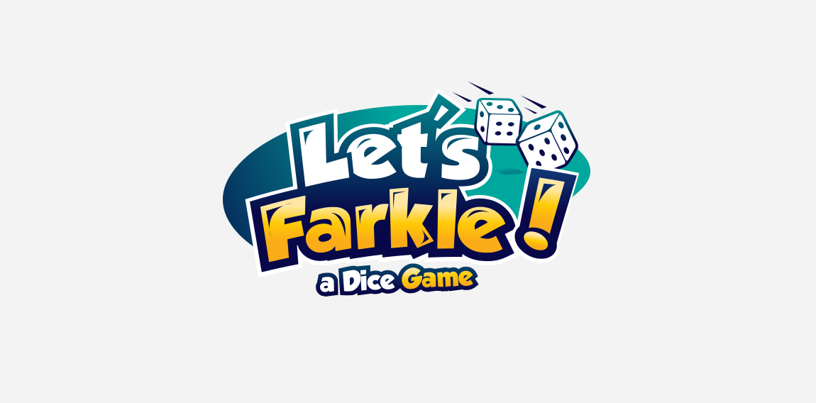
  • playful logo for a dice game with bold font and colors with dice cubes to represent what they do ! Designer: Maher-sh
  • Submitted: 09/19/2017  •   Featured: 10/23/2017
  • Stats: This logo design has 8964 views and is 1 times added to someone's favorites. It has 7 votes with an average of 4.29 out of 5.
  • blue
  • bold
  • colorful
  • dice
  • funny
  • game
  • logo
  • Maher-sh
  • play
  • playful

  Designer  

Maher-sh

View portfolio

  More logo design  

Portofinio Trading Limited

Portofinio Trading Limited is a company who sell promotional materials, and also provide technology equipment to businesses.

After careful thought, in its most basic form the Portofino Trading Ltd product offering (be it promotional items or technology) helps business build connections to grow and succeed. The icon here has been designed to represent the idea of being ‘continuously connected’, growing, adapting and developing. Follow the line in either direction, and at its core you are taken back out towards a different location. Interlocking like a chain that never ends. Also looking like a propeller to represent the clients success with the support and guidance from Portofino Trading Ltd.

This icon also represents the companies ability to build relationships, and quickly adapt and see trends.

Overall the design is confident, timeless, and gives the impression of an established and trustworthy business.

View more information here: http://logogeek.co.uk/?portfolio=portofino-trading-limited

logogeekComments0Apr-19-14
SHUREMAN

This brand could be used by many businesses like entertainment, media, designer, agencies, events, fashion, interior design, games, internet & web, landscaping, yard care and many more

boldflowerComments0May-30-13
Vantage Endoscopy

Inspired by the Spirograph, Urban Jungle designed the identity using a combination of four semi-transparent aqua and ochre circles. The circles symbolize the convergence of two unique corporate entities into one new corporate brand identity — Vantage. Using charcoal for the typeface, the identity blends a vibrant colour palette giving it a fresh, smart and energetic feel, and reflects the youthful and contemporary edge of the company.

urbanjungleComments0Jan-29-13
Brusnika (red bilberry)

Interactive agency.

creartorComments1Oct-09-11

  About  

Logo Inspiration showcases logos, identities and packaging
We are an inspiration and design community that was founded in 2008.
Here, we showcase logos, brand identities and packaging designs created by professional designers, design studios and agencies. We showcase the best work from the best designers from
Join us and upload your work! Register here!

© 2008 - 2026 LogoMoose.com - All logos are property of their respective owners.
FAQ - Privacy Policy - Imprint