im nu
im nu
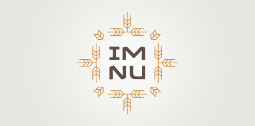


- New logo concept for the barley & rye malt based drink »im nu«.
See the process behind the custom type here: http://dl.dropbox.com/u/14259079/im_nu_process.png
Big view including »Chocolate
 Designer: ArtMachine
 - Submitted: 07/18/2011 • Featured: 07/26/2011
- Stats: This logo design has 7130 views and is 0 times added to someone's favorites. It has 4 votes with an average of 3.50 out of 5.
Designer