LogoMoose
  • Logo
    Galleries
    • Featured logos
    • Most rated logos
    • Most viewed logos
  • Identity
    Galleries
    • Featured identities
  • Packaging
    Galleries
    • Featured Packaging
  • Designers
  • Competition
  • Upload
  • Become Member
  • Login

IDORO

  IDORO  
IDORO
Facebook
fb-share-icon
Pinterest
Reddit
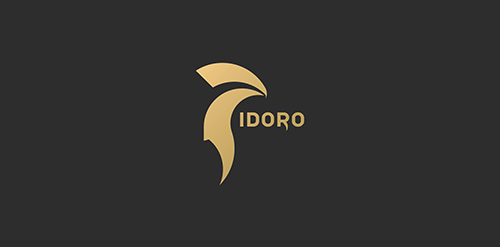
  • IDORO creates custom pure gold busts for clients in the Middle East. The whole company has an antique vibe, represented partly by the Name, which combines "Adoro"(=ital. Love)/"ID"(=Identity) and "Oro" (=ital. Gold). As well as by the Logo itself, which has elements of an antique helmet and a falcon representing luxury and power. IDORO Designer: Philipp Brunsteiner
  • Submitted: 11/21/2014  •   Featured: 12/27/2014
  • Stats: This logo design has 6598 views and is 2 times added to someone's favorites. It has 4 votes with an average of 4.00 out of 5.
  • adoro
  • ancient
  • antique
  • bird
  • bust
  • falcon
  • Gold
  • greek
  • helmet
  • id
  • identity
  • italian
  • logo
  • Logo Design
  • Luxury
  • oro
  • Philipp Brunsteiner
  • premium
  • spartan
  • statue
  • wealth. power
  Designer  

Philipp Brunsteiner

View portfolio

  More logo design  
Atoi

guestComments0May-14-09
toptoo_

logo for web travel service

reformatorComments1May-12-12
Spell Design

A logo for interior & exterior design company.

sadanyComments0Jun-20-17
Royal Society of South Australia

This concept is based around a simple typographical focus on the RSSA acronym. The Society’s diverse scientific interests helped to form this visual approach, ie deliberately avoiding reference to any particular field with a recognisable visual. The intention was to provide a current day sensibility regarding identity design and construction, in combination with more traditional styling for a long established scientific body. To aid this desire, a modern serif was chosen as the primary font and a secondary sans serif for the tagline versions. These fonts were chosen as a combination for their ability to convey this future/past feel. The icon structure has the added effect of allowing the reading of ‘RS’ & ‘SA’ in either direction, and utilises the Society’s formation date within the design, as it adds historical weight and relevance, plus is also a small visual indicator regarding who and what the RSSA represents.

ryleeComments0Dec-25-11

  About  

LogoMoose is an inspiration and design community that was launched in 2008. It showcases logos, identities and packaging submitted by professional designers, design studios or agencies. We showcase the best work from the best designers from around the globe. Become a member now and create your own portfolio!

Get your daily dose of inspiration to work on your own design projects and get your business moving. Be amazed by our logos, identities and packaging on this worldwide platform. We‘re here to inspire you and help you impress your clients and fellow designers. Get an overview of global trends in logos, identities and packaging. Browse our galleries and discover all the latest design trends.
We know you love your work!

© 2008 - 2025 LogoMoose.com - All logos are property of their respective owners.
FAQ - Privacy Policy - Imprint