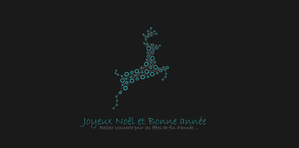
Connected Christmas Reindeer

- A connected high-tech reindeer
 Designer: Cecile Ducrot
 - Submitted: 11/26/2015 • Featured: 11/25/2017
- Stats: This logo design has 8117 views and is 0 times added to someone's favorites. It has 7 votes with an average of 3.57 out of 5.
Cecile Ducrot
Strawberry Assurance is a consultancy firm specialising in risk assessments, security, installation and disaster recovery of IT systems and networks. The logo mark was constructed using triangular shapes to represent the 3 point process in which Strawberry Assurance operates: risk assessment, undertake required tasks to secure IT systems and provide in-house training to the organisation where applicable. The bold angular shape of the mark combined with a carefully selected logo type and colour palette provides the company a with a powerful and authority presence whilst remaining friendly and approachable.
Nantes means wind,sea,sails. In this logo you should be able to see: sails, ship, face, weather vane and anchor. + custom made typeface. Cheers !


