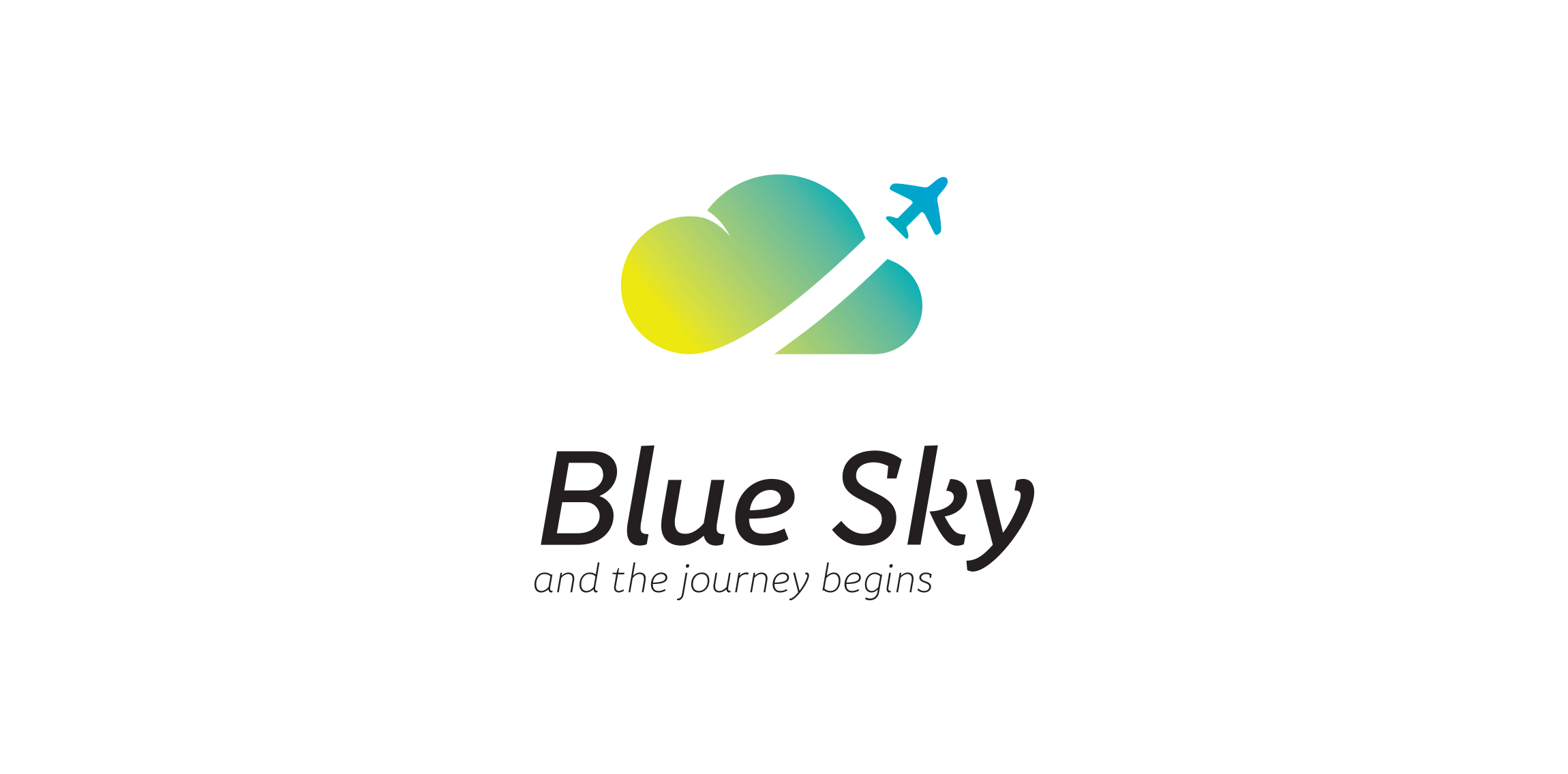
Designer: JABAMighty House founder Peter Charnley already has a very successful high street estate agency, the brand, and website for which was created by Hotfoot, and he approached us again to create a new brand focussed in the highly competitive student market in Lancaster.
Identity! That's what European Decorative's architects and designers were looking for. Here is a concept logo design for their brand using minimalistic mood with wooden colors.
Redesign of the church's old logo in a stylized, illustrative manner, making it more welcoming, contemporary, friendly, casual, & upbeat. Client specified a rendering of the church’s architectural arch and cross in the perspective in this photo, and required an emphasis on the church's nickname, “First Pres."
Here, crisp, exacting vectors emphasize the architectural soundness of the church — a metaphor for the concept of faith as the solid foundation in one's life. This design makes use of hatching to add gradient dimensionality, enabling it to easily reduce down to 1-color. Colors are indicative of the building itself, including terracotta roof. Check my Flickr case study or Dribbble for more images, detail, and full design rationale.