Augeo
Augeo
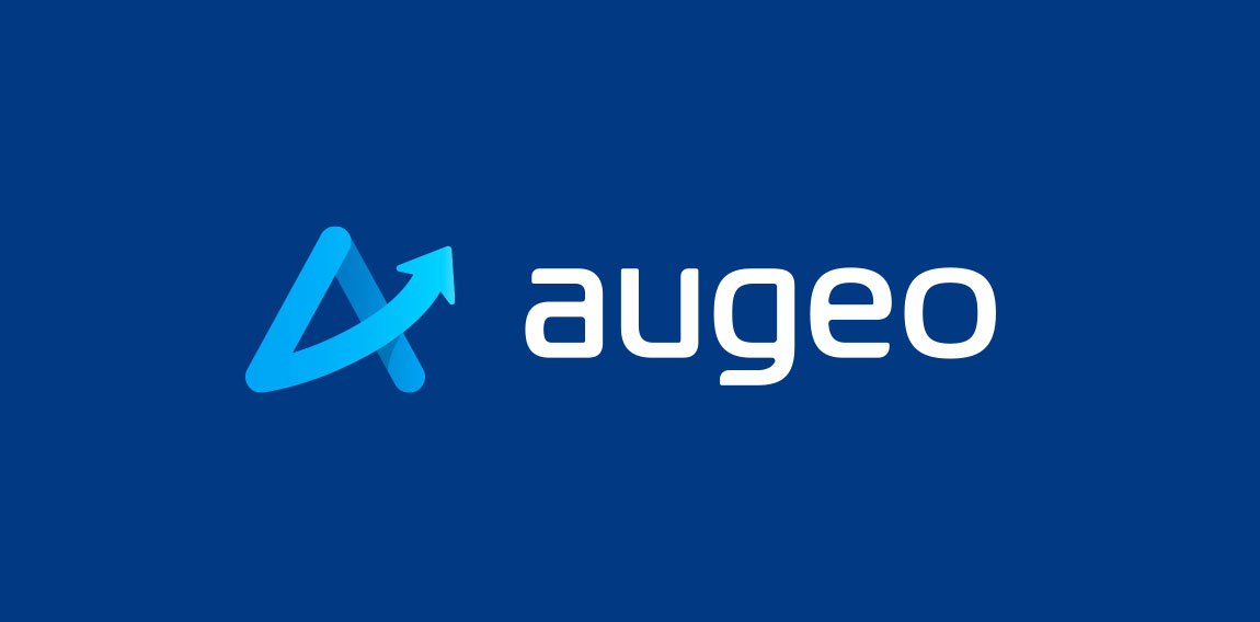


- Augeo is latin for growth. I turned the crossbar of the A into an ascending arrow. I then created a custom modern typeface to accommodate the modern icon.
 Designer: riggdesign
 - Submitted: 02/02/2018 • Featured: 02/16/2018
- Stats: This logo design has 12047 views and is 1 times added to someone's favorites. It has 9 votes with an average of 4.00 out of 5.
Designer