LogoMoose Logo Inspiration
  • Logo
    Galleries
    • Featured logos
    • Most rated logos
    • Most viewed logos
  • Identity
    Galleries
    • Featured identities
  • Packaging
    Galleries
    • Featured Packaging
  • Designers
  • Upload
  • Become Member
  • Login

Sanitas Foundation

  Sanitas Foundation  

Sanitas Foundation
Facebook
fb-share-icon
Pinterest
Reddit
  • Logo design for a medical foundation 'Sanitas'.Sanitas Foundation Designer: Nektarstudio
  • Submitted: 05/19/2013  •   Featured: 06/05/2013
  • Stats: This logo design has 6171 views and is 0 times added to someone's favorites. It has 5 votes with an average of 3.80 out of 5.
  • foundation
  • green
  • heart
  • logo
  • medical
  • Nektarstudio
  • sanitas

  Designer  

Nektar Studio

View portfolio

  More logo design  

Floomba

Fresh, juicy, tasty... but most of all funny and friendly logo full of happiness suitable for a wide variety of business. Sky is the limit ;) ...floomba!

sakyComments1Apr-21-11
Flappers

https://www.behance.net/gallery/14618723/Flappers-Learn-To-Fly Proyecto comercial - Flappers ▲ Learn to Fly “Las FLAPPERS fueron aquellas mujeres pioneras en el siglo XX. El término quería decir algo así como “aladas”, traducido podía entenderse como alegría, vivacidad, persona inconstante, que va de flor en flor”

birpipComments0Sep-25-16
Prawo kultury

Logo for Prawokultury.pl - educational portal about all issues relating to copyrights.

ortografikaComments1May-30-13
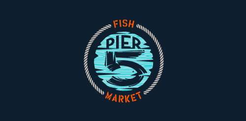
Pier 5 Fish Market – minimal

This logo is for a completely fictitious fish market.

The idea came to me when I discovered that it was possible to achieve a fish shape in the negative space within the bowl of the number 5. Dubbing my hypothetical company Pier 5 Fish Market, I created this illustrative mark in the hopes of really capturing the spirit of the nautical and maritime aesthetic. Type is custom for "Pier" and also the number 5, which is hand-rendered to look like it was painted on a wooden sign with a very wide, worn-out, thick-bristled brush. While it was important for the fish to show in negative space, it needed to look like a seemingly happenstance result of logical, real-world brush strokes. This is the minimal, alternate version of this logo.

Click here to see the case study for this logo, which chronicles its development, and includes full design rationale, sketches, electronic roughs, and alternate designs.

atomicvibeComments1Jul-04-13

  About  

Logo Inspiration showcases logos, identities and packaging
We are an inspiration and design community that was founded in 2008.
Here, we showcase logos, brand identities and packaging designs created by professional designers, design studios and agencies. We showcase the best work from the best designers from
Join us and upload your work! Register here!

© 2008 - 2026 LogoMoose.com - All logos are property of their respective owners.
FAQ - Privacy Policy - Imprint