LogoMoose
  • Logo
    Galleries
    • Featured logos
    • Most rated logos
    • Most viewed logos
  • Identity
    Galleries
    • Featured identities
  • Packaging
    Galleries
    • Featured Packaging
  • Designers
  • Competition
  • Upload
  • Become Member
  • Login

Flower Pop

  Flower Pop  
Flower Pop
Facebook
fb-share-icon
Pinterest
Reddit
  • "Flower Pop" Logo type Flower Pop is music event by FFWD record 2011
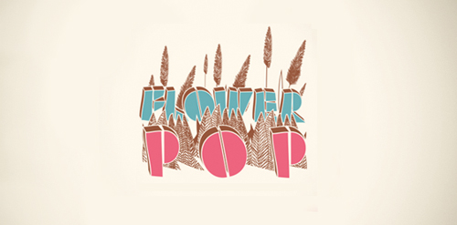
Flower Pop Designer: cheapmink
  • Submitted: 02/23/2012
  • Stats: This logo design has 1756 views and is 0 times added to someone's favorites. It has 3 votes with an average of 3.00 out of 5.
  • cheapmink
  • logo
  • logo type
  • music
  • pop art
  • typography
  Designer  

"cheapmink"

View portfolio

  More logo design  
Jimav

The identity of the builder JIMAV is based on the inspiration that we had with organic architecture. With curved forms we achieved a symbol with plenty life, which is balanced with a simple, legible and solid typography. The logo is a form developed with the approach of the letter “J” of Jiménez and the letter “A”of Avelar, which compound the name of the builder JIMAV. We developed a variety of the logo’s versions and compositions for the use in different applications and to make easier it’s reproduction.

mandarinamoiComments0Nov-06-14
Crow II

From my "Crow" collection.

crowhisperComments0Oct-30-15
Raízes

"Raízes" ("Roots" in English) is a segment for training and distribution of products and services based on Multi-Level Marketing. The name was chosen due to the characteristics of biological functioning of the body's most important tree: the root, the stem laying on the ground and transports nutrients for their survival. These are also the characteristics of this segment: fix market, providing ways of working and bring products from their suppliers to the attention of the population, as a large tree attached to the ground, beyond that required for the ecosystem, offers plenty fresh who are in need.

psekimgComments0Mar-11-13
You Communications

Circular shape with speechmarks reaching out show the communications specialism. The coloured lines show the diversity of their clients and the offer. The lack of symmetry of the lines adds energy - the feeling of communication lines buzzing. Logo represents

alexhearntbaComments0Sep-11-13

  About  

LogoMoose is an inspiration and design community that was launched in 2008. It showcases logos, identities and packaging submitted by professional designers, design studios or agencies. We showcase the best work from the best designers from around the globe. Become a member now and create your own portfolio!

Get your daily dose of inspiration to work on your own design projects and get your business moving. Be amazed by our logos, identities and packaging on this worldwide platform. We‘re here to inspire you and help you impress your clients and fellow designers. Get an overview of global trends in logos, identities and packaging. Browse our galleries and discover all the latest design trends.
We know you love your work!

© 2008 - 2026 LogoMoose.com - All logos are property of their respective owners.
FAQ - Privacy Policy - Imprint