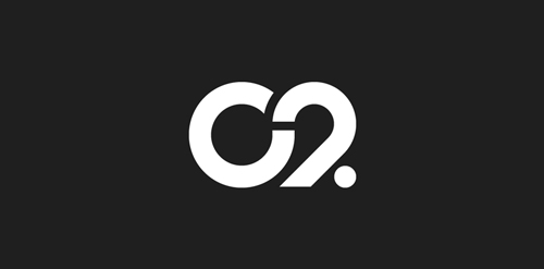
LogoMoose
  • Logo
    Galleries
    • Featured logos
    • Most rated logos
    • Most viewed logos
  • Identity
    Galleries
    • Featured identities
  • Packaging
    Galleries
    • Featured Packaging
  • Designers
  • Competition
  • Upload
  • Become Member
  • Login

C2

  C2  
C2
Facebook
fb-share-icon
Pinterest
Reddit
  • The city of Torcy, France recently built a great complex dedicated to the promotion of Culture & Arts, highlighting local and national artists. I was contacted to work on its complete Brand Identity, including Naming, Logotype, visual identity, Print communication, exterior & interior signage, website design and clothing.

    The main goal was to create a total new and innovative identity. Naming took a great part in that sense. I focused on trying to create a simple yet effective name for that building. C2 was chosen from a couple of hundred names for its international recognition, pronunciation and readibility. It stands simply for Cultural Center or the two initials 2xC -> C2.

    As far as the logo is concerned, it followed in a logical way the naming process. A will to create a modern and contemporary logotype, yet efficient, minimal, powerful and durable. It was created so it could nicely fit and be readable at a great or tiny size on any document. The logotype guidelines show a slight dipping of the « C » and the « . » to create the optical illusion that all characters are aligned on the same baseline. C2 Designer: Franck Juillot
  • Submitted: 12/30/2011  •   Featured: 12/10/2013
  • Stats: This logo design has 16348 views and is 2 times added to someone's favorites. It has 5 votes with an average of 4.20 out of 5.
  • art
  • c2
  • Center
  • cultural
  • culture
  • Franck Juillot
  Designer  

Franck Juillot

View portfolio

  More logo design  
Fox Steady

Just for fun.

ancitisComments1Jul-25-14
Carpintería Francisco Gomila

guestComments0May-18-09
Hi Tech Security

Hi Tech Security install, service and monitor security systems.

ngizedComments1Mar-22-15
InLithuania

Logo InLithiuania We have created a logo for a company that is engaged in tourism activities in Lithuania. We chose him a symbol that perfectly reflects the company's activities. This is a figure depicting Lithuanian folk motifs and letters. We created the symbol, the Lithuanian '' green. Additionally, we adjusted the company name for which we chose the white font. The result is modern, attractive, aesthetic.

gintautasbruzasComments0Dec-06-17

  About  

LogoMoose is an inspiration and design community that was launched in 2008. It showcases logos, identities and packaging submitted by professional designers, design studios or agencies. We showcase the best work from the best designers from around the globe. Become a member now and create your own portfolio!

Get your daily dose of inspiration to work on your own design projects and get your business moving. Be amazed by our logos, identities and packaging on this worldwide platform. We‘re here to inspire you and help you impress your clients and fellow designers. Get an overview of global trends in logos, identities and packaging. Browse our galleries and discover all the latest design trends.
We know you love your work!

© 2008 - 2026 LogoMoose.com - All logos are property of their respective owners.
FAQ - Privacy Policy - Imprint