New Sky Productions
New Sky Productions
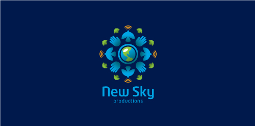


- Proposal for New Sky Productions, a passionate, socially responsible company with a global reach based on powerful visual storytelling and compassion through journalism and use a range of multimedia elements to deliver the message.
 Designer: Sean Heisler
 - Submitted: 07/18/2011 • Featured: 09/25/2011
- Stats: This logo design has 4479 views and is 0 times added to someone's favorites. It has 8 votes with an average of 3.75 out of 5.
Designer