LogoMoose
  • Logo
    Galleries
    • Featured logos
    • Most rated logos
    • Most viewed logos
  • Identity
    Galleries
    • Featured identities
  • Packaging
    Galleries
    • Featured Packaging
  • Designers
  • Competition
  • Upload
  • Become Member
  • Login

Mango Lounge

  Mango Lounge  
Mango Lounge
Facebook
fb-share-icon
Pinterest
Reddit
  • This was a second year university brief to choose a local client and show the benefits of design to a business. I choose a local tapas bar in Cardiff, after talking to the owners and a slight name change from 'Mango - Tapas Bar' to 'Mango - Lounge' I began working on concepts. 
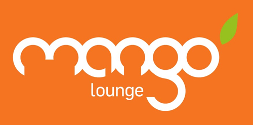
After attempting to modify different fonts I created my own custom mark from scratch. Based on the shape of a mango and other cypriot fruit I realized all the letters could be formed from circles. I used this discovery to create the logotype, each letter hand drawn based on one or two interlocking circles. A bright orange colour that reflects the bar's food and atmosphere and a single green leaf to suggest freshness.Mango Lounge Designer: designlouder
  • Submitted: 05/18/2011
  • Stats: This logo design has 2704 views and is 0 times added to someone's favorites. It has 4 votes with an average of 3.50 out of 5.
  • bar
  • branding
  • design
  • designlouder
  • Dyer
  • logo
  • Louder
  • lounge
  • Mango
  • Peter
  • Tapas
  Designer  

designlouder

View portfolio

  More logo design  
Atoll Tour

Logo design for Atoll Tour

logodesignerComments1Jan-23-13
Genomics and Proteomics

Genomics and Proteomics is a new academic major at the Faculty of Science, Masaryk University. The major focuses on the study of the genome and its relation to the creation of proteins.

The identity introduces a stylization of the well known DNA double helix. The crossings also refer to the relation of the two focuses of the major, as do the two colors. The green segment pays the respects to the natural origin of the major and to the production and generation aspectof the Genomics - Proteomics relation.

handmadedreamsComments1Apr-13-12
Зелёная линия (Green Line)

Designer: Denis Aristov Client: Administration of Perm City Industry: Tourism (Main Walking Route of Perm) Keywords: green, line, tourism, walking, route, Perm

denis-aristovComments0Apr-06-12
Nonn’s

Nonn's has been in business for thirty years, we updated to a more upscale image to show the diversity with the brand and interior design service. The icon works together or separate.

catnerinef3Comments0Feb-12-15

  About  

LogoMoose is an inspiration and design community that was launched in 2008. It showcases logos, identities and packaging submitted by professional designers, design studios or agencies. We showcase the best work from the best designers from around the globe. Become a member now and create your own portfolio!

Get your daily dose of inspiration to work on your own design projects and get your business moving. Be amazed by our logos, identities and packaging on this worldwide platform. We‘re here to inspire you and help you impress your clients and fellow designers. Get an overview of global trends in logos, identities and packaging. Browse our galleries and discover all the latest design trends.
We know you love your work!

© 2008 - 2025 LogoMoose.com - All logos are property of their respective owners.
FAQ - Privacy Policy - Imprint