The city of Torcy, France recently built a great complex dedicated to the promotion of Culture & Arts, highlighting local and national artists. I was contacted to work on its complete Brand Identity, including Naming, Logotype, visual identity, Print communication, exterior & interior signage, website design and clothing.
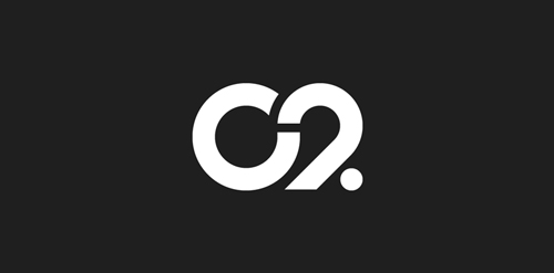
The main goal was to create a total new and innovative identity. Naming took a great part in that sense. I focused on trying to create a simple yet effective name for that building. C2 was chosen from a couple of hundred names for its international recognition, pronunciation and readibility. It stands simply for Cultural Center or the two initials 2xC -> C2.
As far as the logo is concerned, it followed in a logical way the naming process. A will to create a modern and contemporary logotype, yet efficient, minimal, powerful and durable. It was created so it could nicely fit and be readable at a great or tiny size on any document. The logotype guidelines show a slight dipping of the « C » and the « . » to create the optical illusion that all characters are aligned on the same baseline.
1Dec-10-13
Sreca je u nama (Happiness is within us)
The brief was to create logo for life coach and art of living workshop "Happiness is within us" and to use posture that symbolizes happiness. www.lifecentar.com
The idea
Happiness posture + butterfly + tree
The logo is combination of asana that represents happiness presented through the symbols of butterfly and tree. Butterfly symbolizes change (metamorphosis), and in Japan is considered to represent one's soul. Tree symbolizes stability, longevity, and strength. Connection of mind and body is shown through these symbols. Energy vital points on the body are colored in gold: feet, palms, heart, third eye and point below navel.
0Jun-25-13
Logo for a make-up artist. Simple junction of a swan (beauty symbol) and an eye (the subject). Also the neck of a swan is shaped into the letter S for Simona.
0Jan-06-17
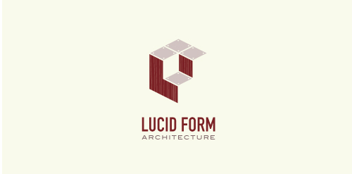
This logo is for a completely fictitious architecture studio called Lucid Form Architecture.
The icon is based on an optical illusion of a cube within a cube. Primarily, the form depicts a big cube, made of wood walls and metal-plated top surfaces, with a notch cut out of the center, resulting in a 3-D "L" shape. However, the longer one looks at this, perception begins to shift, resulting in a couple of different interpretations: 1) a small cube with a wooden wall and metal-plated bottom, in the corner of a room, hovering near the top of a tiled ceiling; 2) a room, tilted 90° clockwise, with hardwood floors, tiled walls, and a cube with a wood countertop and metal-plated side on the floor in the corner. This perception shift is important to the name, because it presents an ironic twist. To make "lucid" means to make clear, and while the icon seems to initially baffle and confuse, it ultimately encourages the viewer to challenge his or her preconceived notions of "perception." So too is the Lucid Form methodology for creating seeming impossible structures.




 Designer: Fantomachine