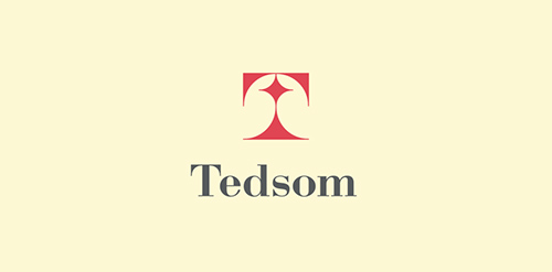
Half-symbolic, half-typographic concept. I have started with a concept of a road leading ahead, with a guiding star above, showing the way. Then, I had to add top serifs to get the letter "T", and with a little stretch of imagination it could be interpreted (or rather the negative space it creates) as the night-sky`s sphere.
I am pretty happy with the shape I have ended up with. It is purely geometric, simple, elegant, unique and strong. Of course it is also the initial of the company name, and the hidden message can be viewed as added value.
Colourful Days (Chromatistes Meres) is a company active in the field of experiential education, with programs for children as well as training seminars for adults.
The programmes, divided in thematic circles are designed by specialist educators – animators, and cover a variety of educational and entertainment-related subjects.
The target is the high quality of the end result. Every programme is experiential as well as educational.
Built around theatrical games, it accomplishes its target through games, constructions and a lot of imagination, providing to children the opportunity to play, to express themselves and to create.
The logo, inspired by the ‘circles’ of the programmes has been designed so as to express joy, playing, movement through a mosaic of colours and experiences




 Designer: Jozef Javorsky