2016 logos (1159)

Logo design for a Dutch legal advisor. The rooster comes from the name.


STAIRS


A logo for a website for games..

A wholesale distributor of agricultural supplies. Chimayo means bighorn sheep in Taraumara language.
A visual iconic logo, with letter "M"(Matilha) located on the face of the wolf.

A logo for academy for kids located in Alexandria, Egypt.

For sale!

A material sourcing and procurement agency run by two great female entrepreneurs. Word play on Sorcery and Sourcing.
Logo for Wurst Eden - Best Sausage Joint in Town!

A french based choir and orchestra named after the espresso Ristretto. Little singing birds.

"my Dog & I" Logo developed for a dog training school.

Design laboratory.

A brand of www.cubicus.mx
Logo for Danamex Trade Ltd that is engaged in export and distribution of healty food products to Canada.

The logo idea for a company, which deals with business tourism in China, providing logistics services, assistance in finding suppliers and cargo declaration.

EB WiFi

A brand of cowboy boots. Western Boots for women.
Happy Sloth by Boldflower Design Studio
San Trovaso Logo

This logo was uploaded on 99designs.com The CH want for the logo that it oposite with the company name. It means not playful, just strong and simple. So this is logo I come up with. The reason why I upload this on here is for seeing any critique and suggestion. I'm sorry for my bad english. Thank you :)
Studio Copper is an american company that handcrafts genuine copper mugs that was born in 2015.
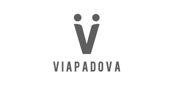
Once upon a time, the area known as Via Padova in Milan, Italy, had a less than salubrious reputation. Our project was to help change that image by creating a new identity for the area that would bring the various groups of people – or local tribes as we called them – together. We needed to represent Via Padova as a space that welcomed every one of its citizens – a challenging proposition. The city needed a visual system, a graphic identity that could organise and simplify communication with the people. We used the letter V to symbolise a handshake – and hence the union and coming together – of two people, symbolising a community coming together.
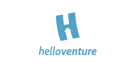
Hello Venture is an organisation that brings start-up communities together and creates spaces for entrepreneurs to learn and work. In this case, the brand identity that we created focuses on the letter H with an arrow inside to symbolise the progressive growing of the new enterprises. The H is flying up. The logotype is set in lowercase letters to emphasise the company’s humble and friendly approach. The colour scheme represents security and confidence. The result is a minimalist identity with customised typeface and flexible print material.