September 2013 logos (147)

Logo for a company that stands for sustainable, industrial lighting solutions, aimed at businesses.


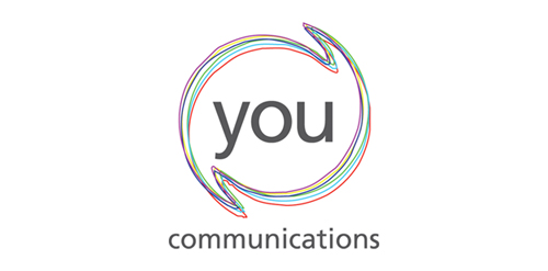
Circular shape with speechmarks reaching out show the communications specialism. The coloured lines show the diversity of their clients and the offer. The lack of symmetry of the lines adds energy - the feeling of communication lines buzzing. Logo represents
We created logo for FINEUS – a company that offers Business Intelligence solutions.

Logo designed for photographers couple. Reflection of the "N" character used to create camera image.
Logo is the answer to the nature of the application which is map of people and companies.
In terms of typography letter V is presented as a marker.
The space between the characters is divided into 3 parts rhythm which refers to the password flagship applications, "Be (here with) You"

Ecological home builder logo.
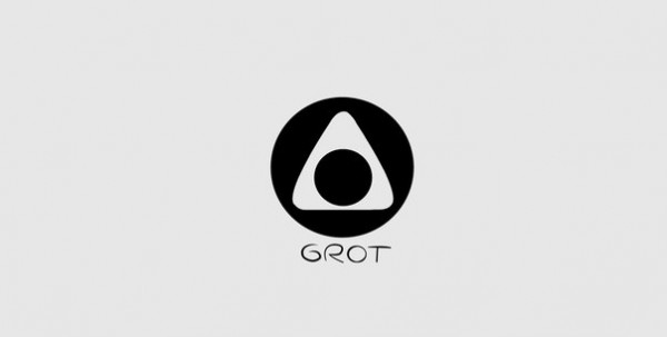
Grot, club, dance, music, dj
Beauty salon

Logo for a green staffing agency.

Vietnam National Museum Of History

Ballet

Unused proposal for Canadian Paint company, name changed. Logo shows an abstract maple leaf in the negative space.

a logo design for rating the social sites and works.

logo created for a wine store based in mexico.
We created logo for Kacper company, engaged in the import and export of fruits and vegetables.
We created logo for Polish skier Wojtek Szczepanik.

Biofuels

Logo for pizzeria named Pizza Slavonija. Slavonija is a region in Croatia that is known for its wheat and green fields.

Asia News Network

logo created for a patrimonial services based in mexico.

naming and logo created for a trading company based in mexico.

Logo for Polish crowdfunding site. http://gobeez.net