July 2013 logos (190)

clothing & accessories


Just for fun

This logo design is perfect for an organization, corporate or foundation.

Splashy logo made in a complete 3D finish.

Visual design
As a degree project, I designed an identity for Korea by manipulating Hangul, the Korean alphabet, to form English alphabet.

G

Logo for a jewel artisan association. In the amazon area

Brand name : Rogues Gallery / Field: Animation, vfx / Year : 2012 / Location : USA

An initial logo that was designed for high end technological company.

A logo design for arooster.com in which ive created an A shaped rooster. By Gregory Grigoriou

Logo for Baloon

Logo for real estate

Micetake

Brand name : Sidea Field: Vintage interior and furniture Year : 2013 Location : India Branding Agency: Bratus

In the designer's words:
A simple logo with a geometric lettering. VERA, which means true. Suitable for brands operating in the cosmetics, fashion, which is available with a strong push on the youth market.
Ideal for these industries
Cosmetics & Jewelry
Fashion & Apparel
Pharmaceutical & Bio Tech
Tags that describe this logo
fashion, style, lettering, wordmark, young
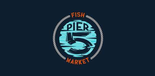
This logo is for a completely fictitious fish market.
The idea came to me when I discovered that it was possible to achieve a fish shape in the negative space within the bowl of the number 5. Dubbing my hypothetical company Pier 5 Fish Market, I created this illustrative mark in the hopes of really capturing the spirit of the nautical and maritime aesthetic. Type is custom for "Pier" and also the number 5, which is hand-rendered to look like it was painted on a wooden sign with a very wide, worn-out, thick-bristled brush. While it was important for the fish to show in negative space, it needed to look like a seemingly happenstance result of logical, real-world brush strokes. This is the minimal, alternate version of this logo.
Click here to see the case study for this logo, which chronicles its development, and includes full design rationale, sketches, electronic roughs, and alternate designs.

Logo was created for an insurance company. The logo incorporates a classic, ornamental icon and clean font.

Logo for trees

Logo for real estate

Logo for travel

Logo for tree