
Pending logos
Pending logos – Page 29
Luxury car rental


Las tapas de siempre

Productos artesanos · La buena tradición mediterránea

Vino DO Castilla la Mancha
Vino DO Castilla La Mancha
Restaurante, Escuela y Asesoramiento

Equipamiento clínico y Suministros dentales

Clinica Veterinaria · Italia
Constructora e Inmobiliaria

Inversiones Inmobiliarias

Dental Products
Servicios inmobiliarios

Distribución de materiales de construcción

Distribuidor oficial Orange en Castellón, Islas Baleares, Alicante y Murcia.
Topógrafos
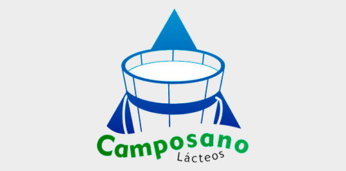
Lácteos en porciones

Amblar Abogados
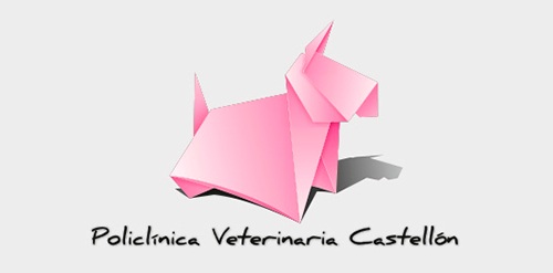
Policlínica Veterinaria Castellón
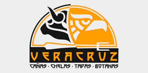
Bar especializado en tapas españolas y mexicanas.

Designed for bathroom installation company based in the UK
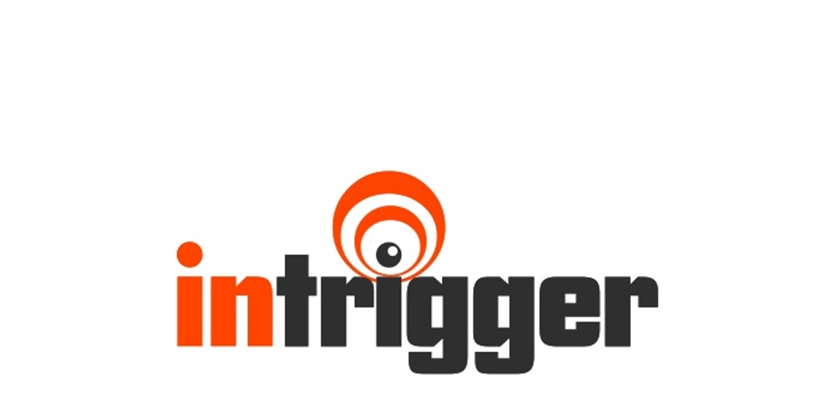
company develops software for content providers that triggers pop up registration after hitting a certain amount of click throughs... thus the TRIGGER... used an EYE because the software is watching the user waiting on clicks and to trigger the popup... thus the wave and "letter i" play

This we took an old design and color theme... same font and turned it from 1990's to 2010's - Used the D and spun it... got a cool circular icon
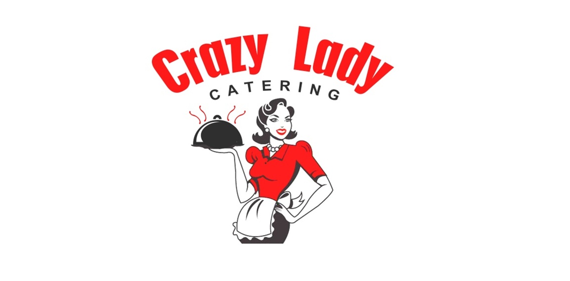
Wanted a bold 50's style woman in Red/Black for bags. catering company by a wild lady, not a CRAZY lady lol.
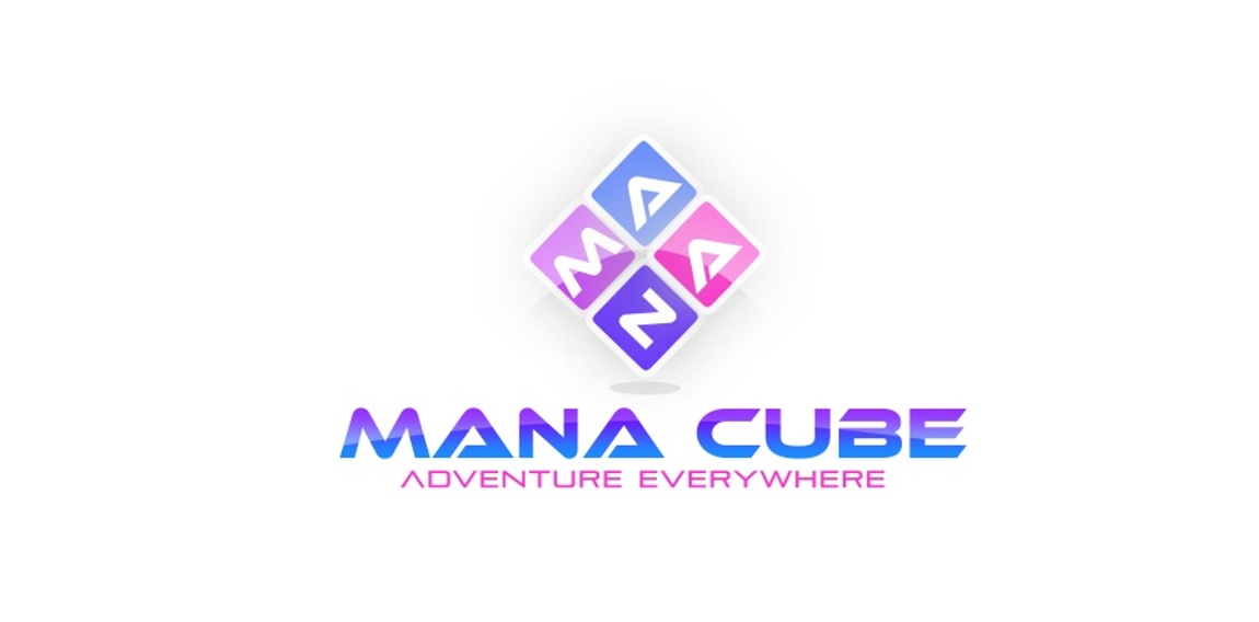
Online game - app maker... wanted pinks blues and purples, and not necessarily an actual cube in the logo, created a 3 dimensional block that spells mana, a flip, shadow and a cool effect made this one pop.