Logo inspiration
Inspirational logos
Logo for on-line recipes.


Logo for wine enthusiasts.

Glowe logo
Logo creation for a photograph.
Yachting Service logo
Entertainment
Ecocity logo
Logo for spin-out company dedicated to the professional preparation of EU projects. Logo symbolizes letter F and man raising hand.

Logo was created for site deappetizer.com. Deappetizer.com is for people, who used to eat a lot, but decided to do something to reduce their appetite. Idea is simple and clever in my opinion: the site presents unpleasant pictures, which should spoil your appetite. And before a meal you can visit this site to change your perception of food for a while. All of the pictures are divided into three levels by their effect. The further the stronger. Concept: imagine that «Deappetizier» is very unusual restaurant, where guests come to refrain from eating, so the primary duty of a waiter is not to allow a guest to eat. All the waiter’s efforts to discourage guest’s appetite formed the basis for a series of logos for each level of pictures: Level 1 https://www.logomoose.com/members/alisa1711/showcase/logo/244/ Level 2 https://www.logomoose.com/members/alisa1711/showcase/logo/245/ Level 3 https://www.logomoose.com/members/alisa1711/showcase/logo/246/ Also you can see logo in bigger size and on the white background at http://revision.ru/work/36475/
Some experiment about verbicon, i hope you like :)
Logo for a beauty hair salon in UK.
Travel company
This logo was made for a blog that is about giving tips on how to fall asleep and how to wake up early.
Logo for an online directory..
The new logo proposal for Monarch Bath Pvt. ltd. Monarch bath Pvt. Ltd. has various models active in the collections o f bathroom fittings and sanitary wares and regularly adds several new designs and brands to the product portfolio. The Company has also an exclusive range of sanitary ware to offer with a very wide choice in designer bathroom sets, wash basins, bathtubs and related items.
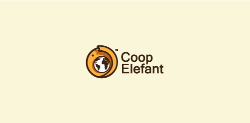
Coop Elephant logo
Buffalo Dining Club is a new concept bar from the team that brought us Table for 20 and Sticky. It centres on good produce, good service and good times. The identity created takes cues from mid 20th century diner-style brands and typography as well as drawing inspiration from classic Americana.
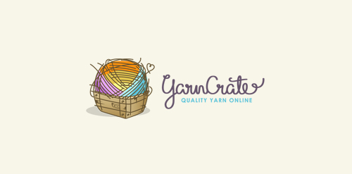
Logo for a company selling quality yarn online. Custom made font for the name. Their upcoming official website address: http://yarncrate.com/
☆ HONORS ☆

-
shtef-sokolovich
190 logos
-
Boldflower Design Studio
189 logos
-
Ailton Marques
115 logos
-
Light Rainer
114 logos
-
Alek • Triptic.pl
107 logos
-
sadany
96 logos
-
almosh82
96 logos
-
Duminda Perera
93 logos
-
Aleksandar
91 logos
-
pizelato™
91 logos